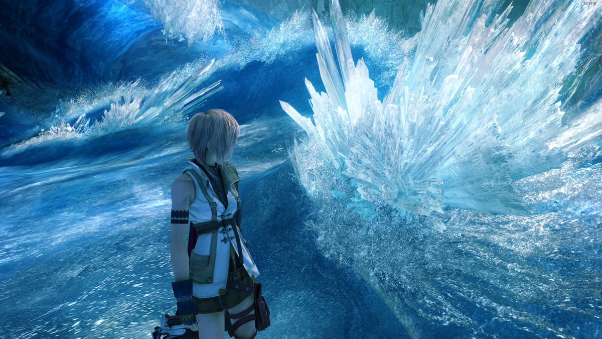
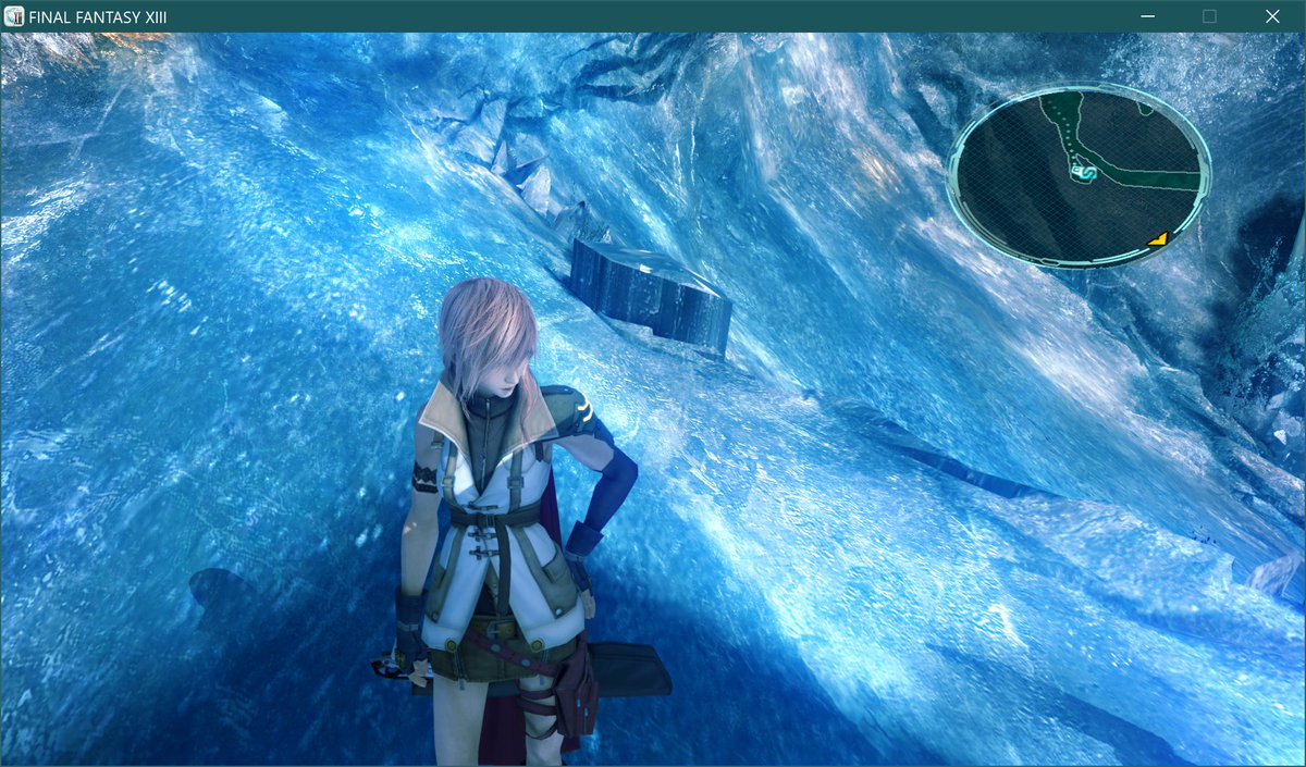
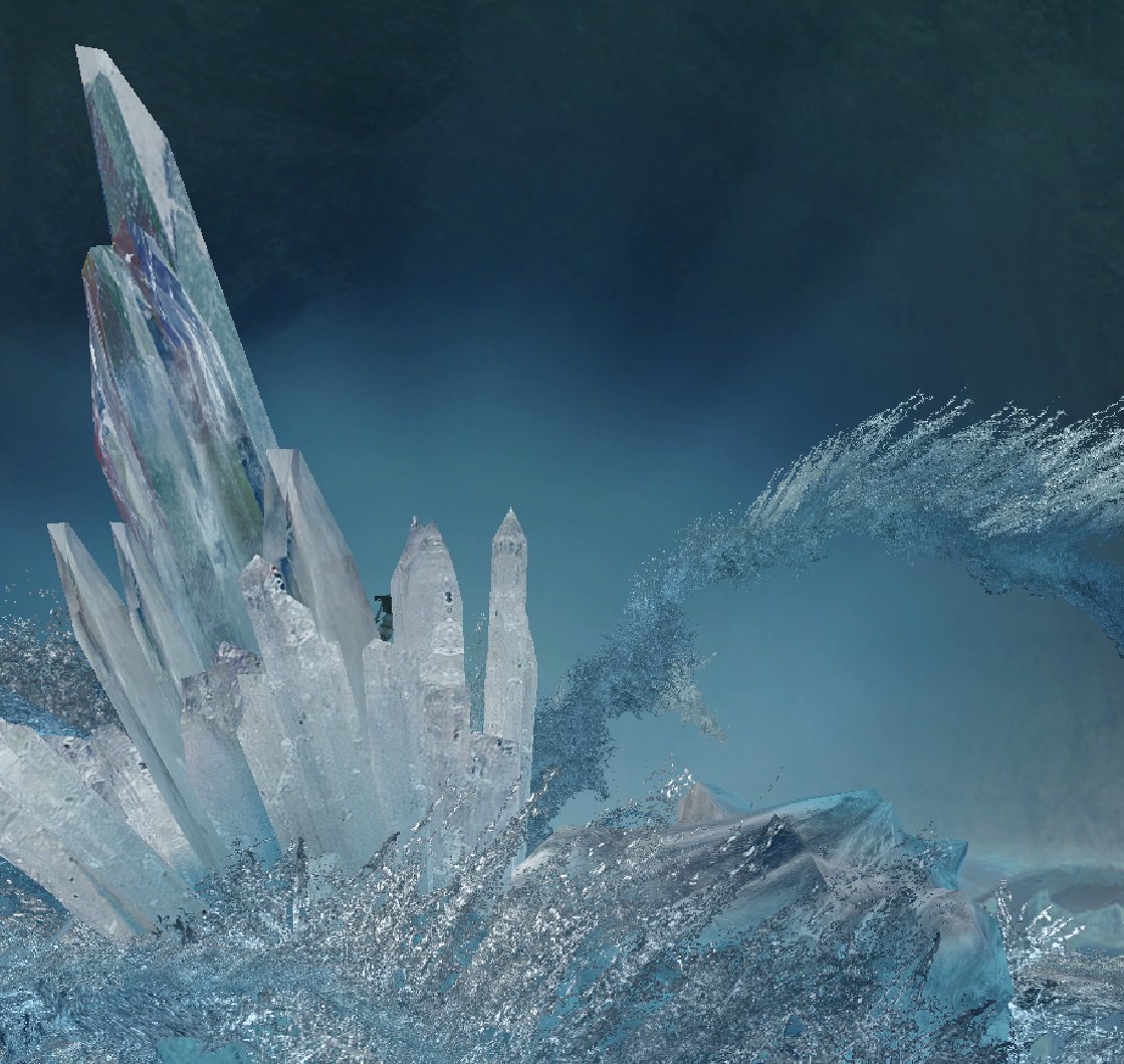
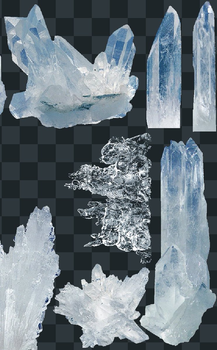
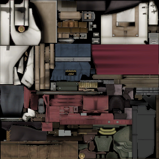
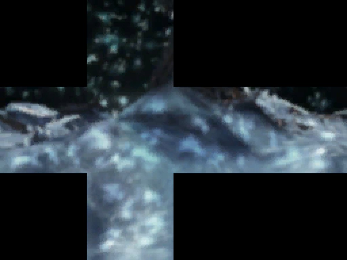
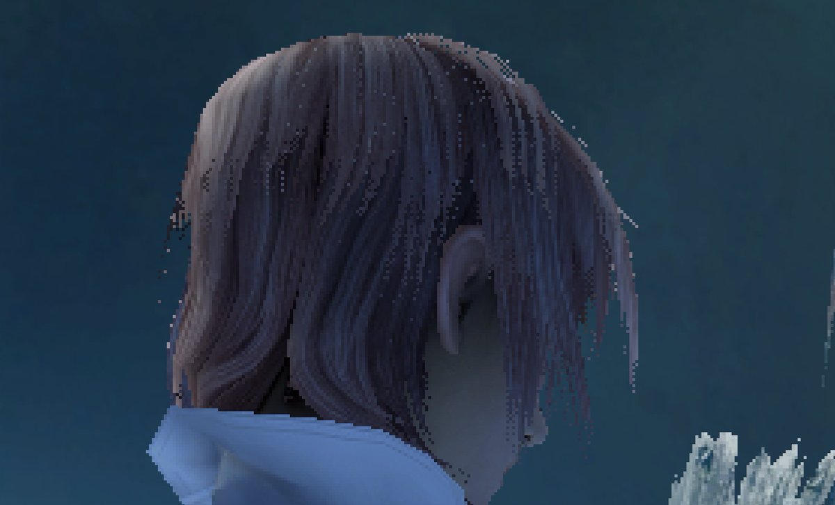
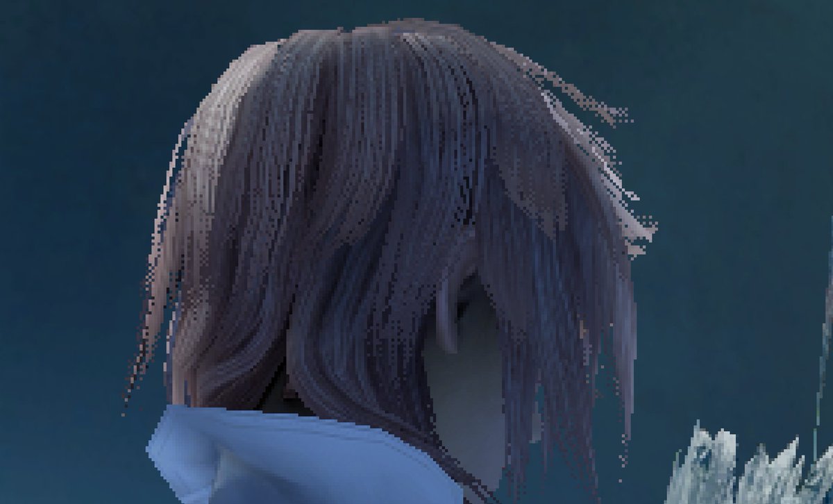
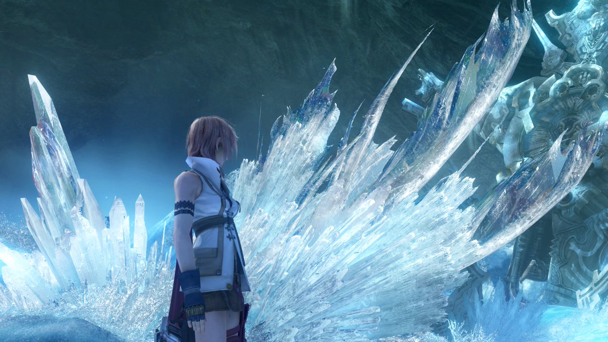
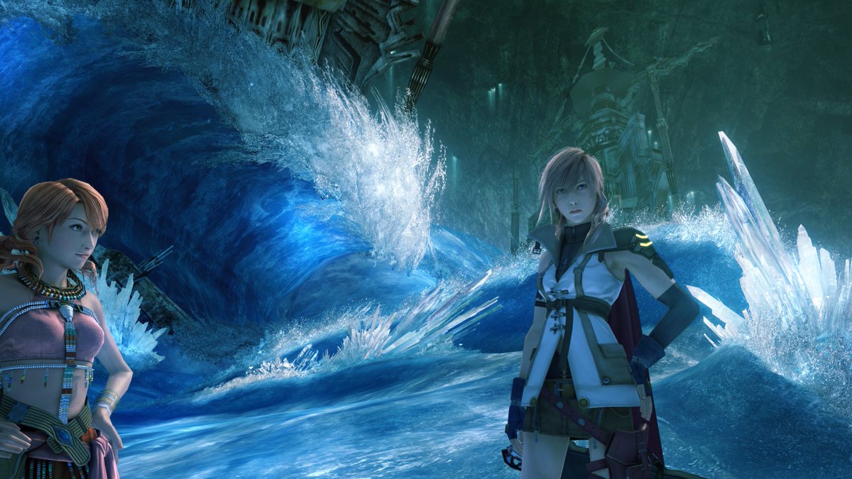
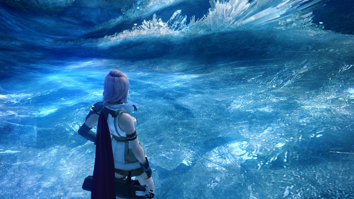
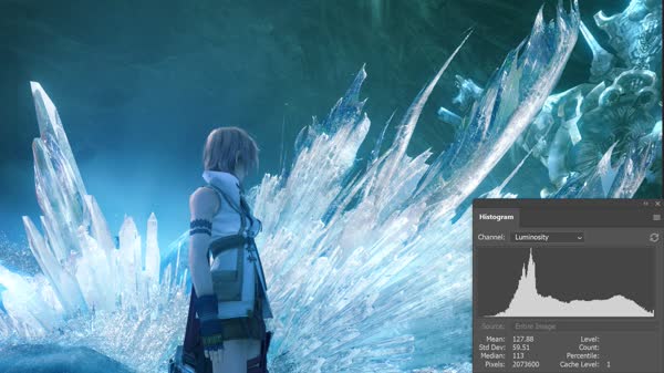
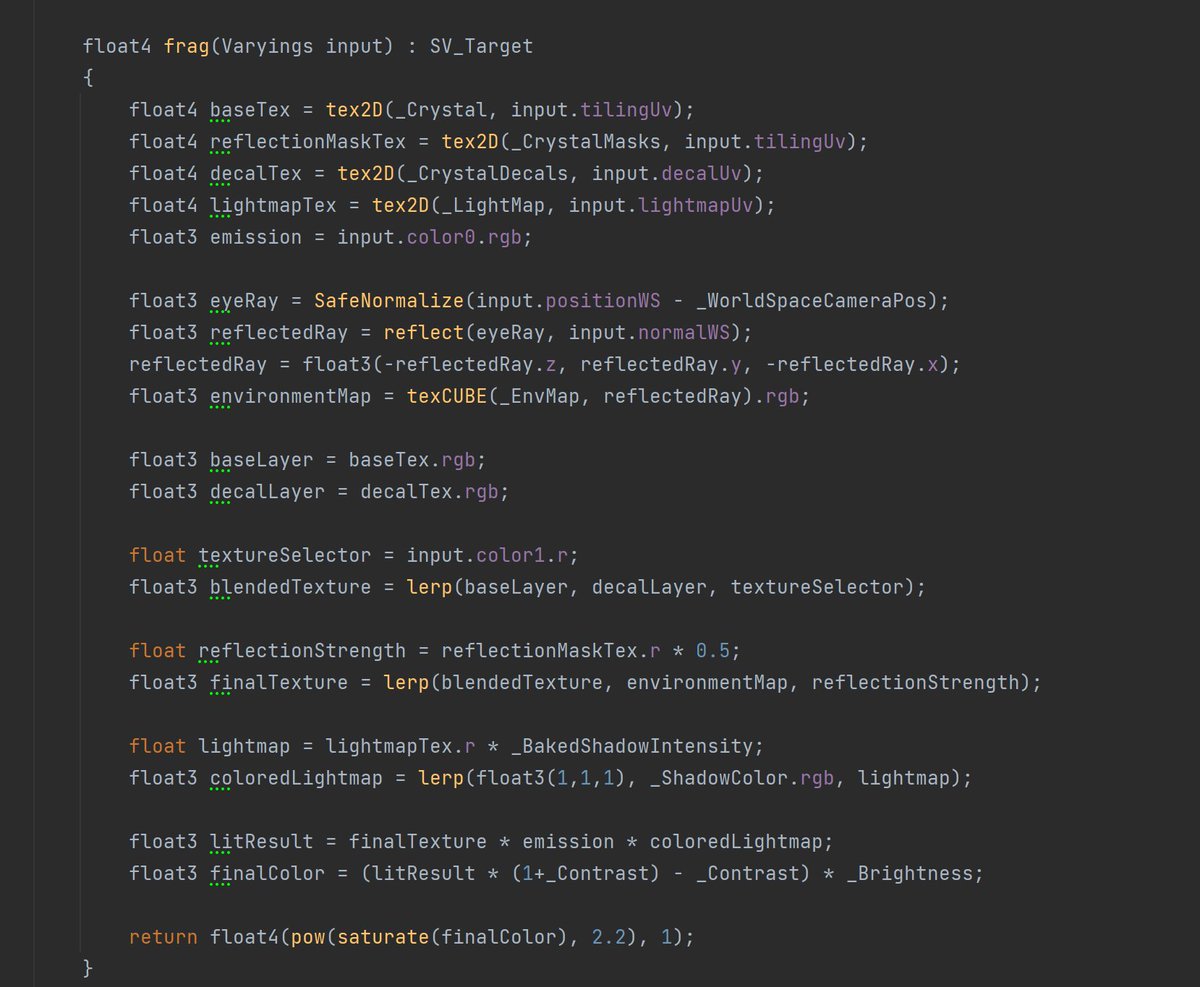
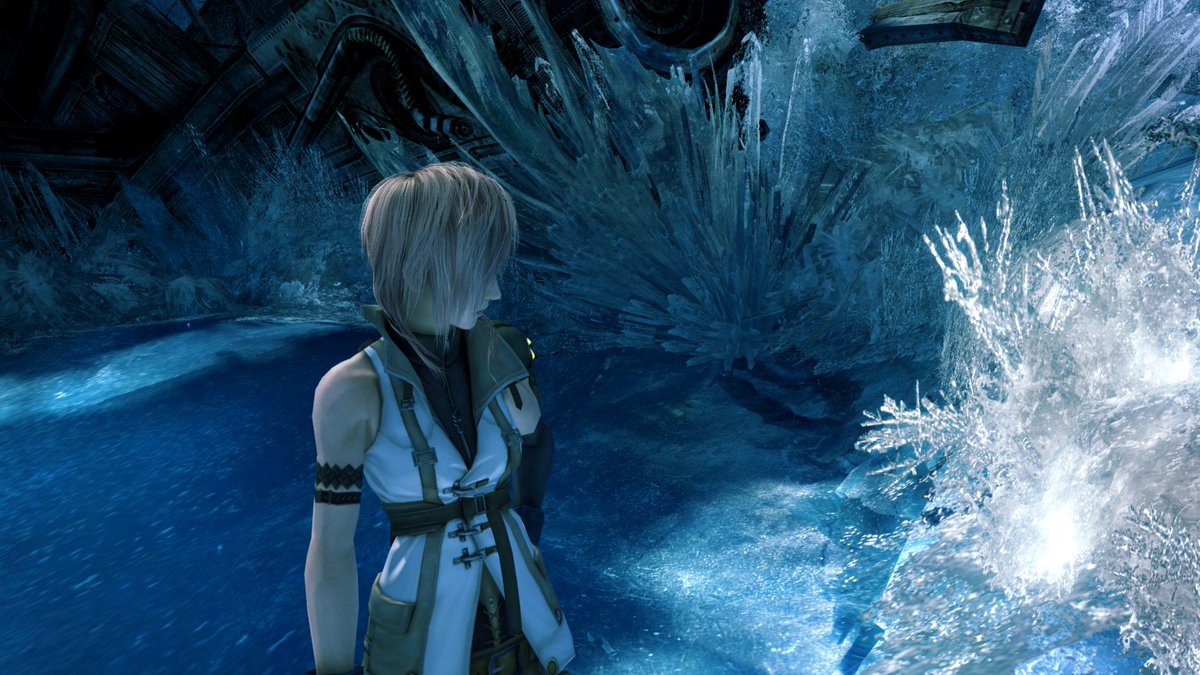
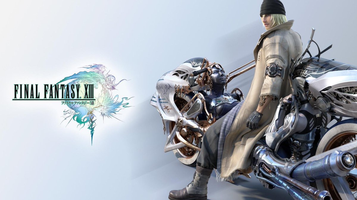
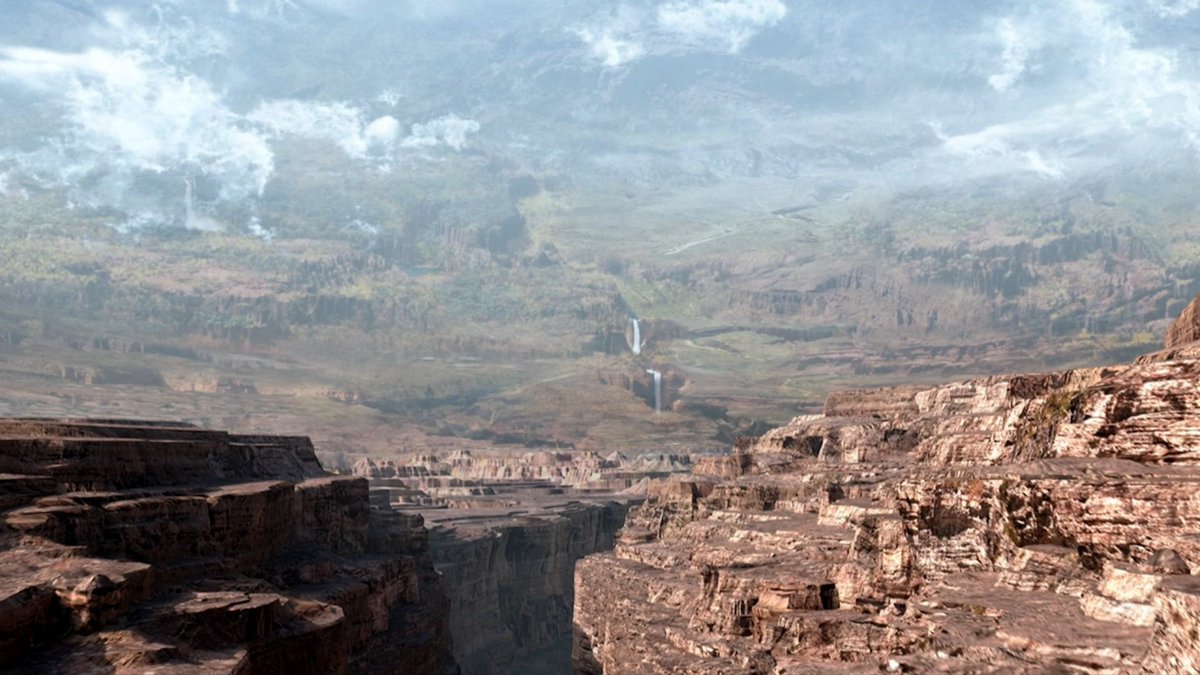
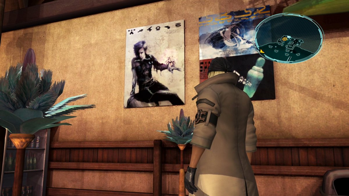
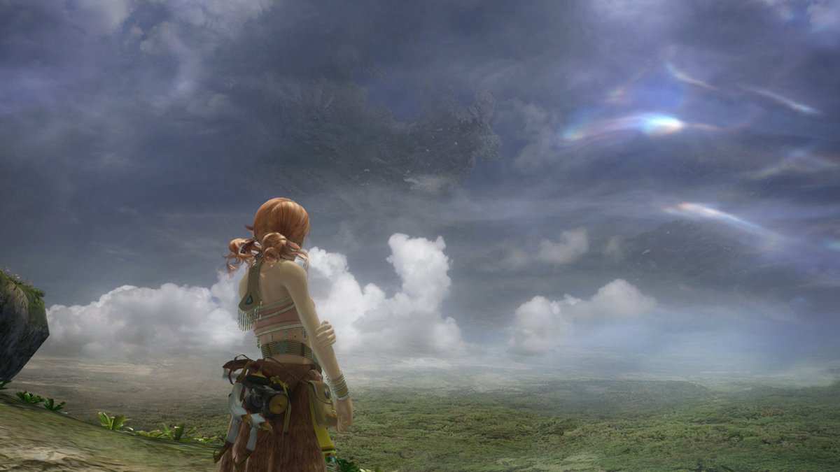
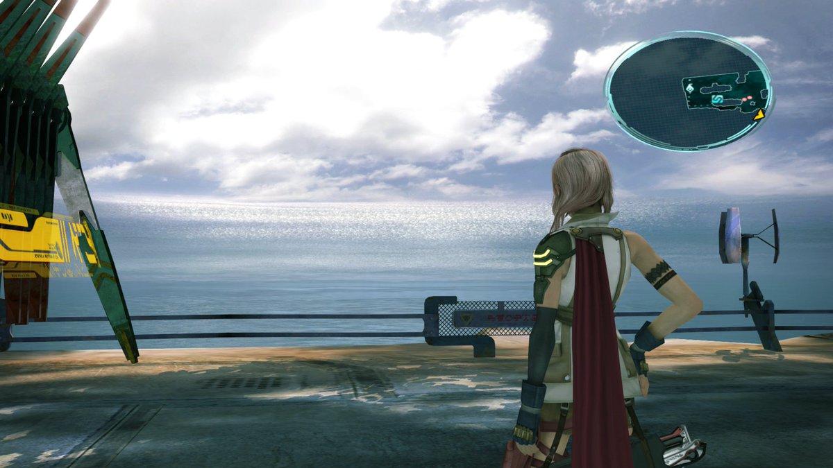
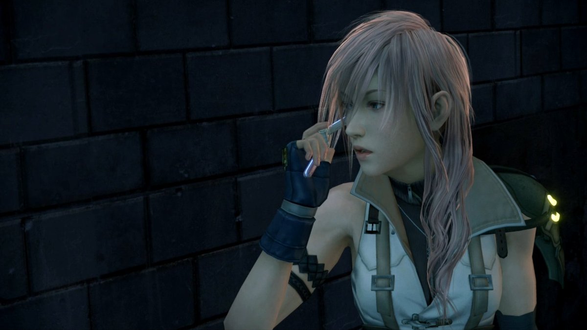
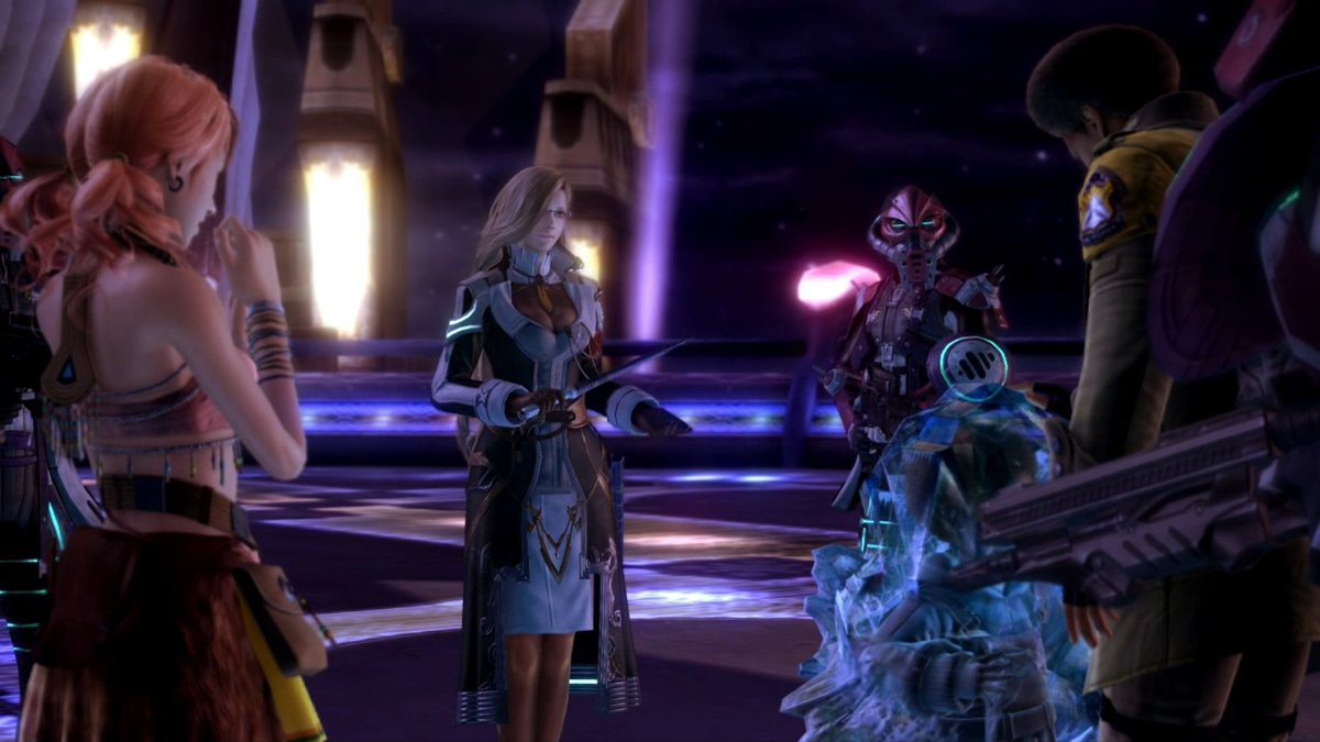
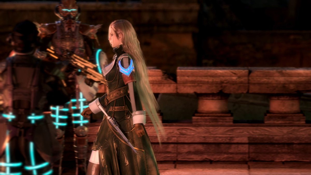
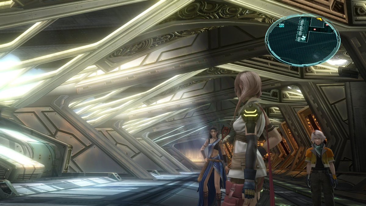
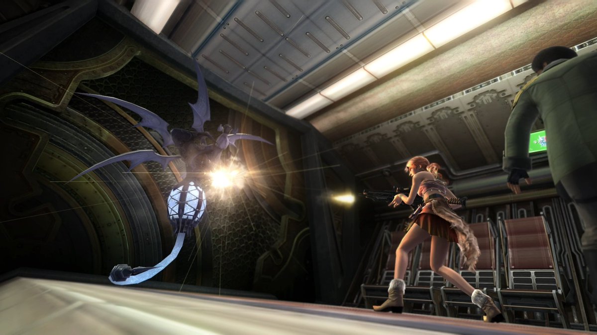
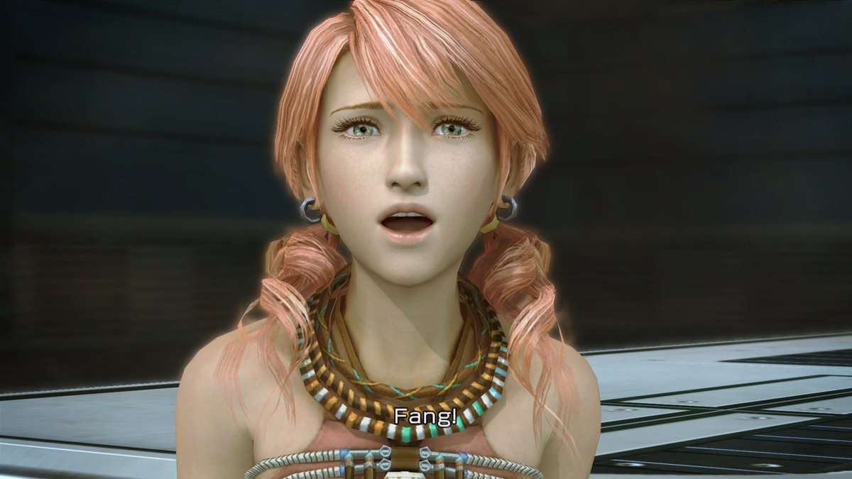
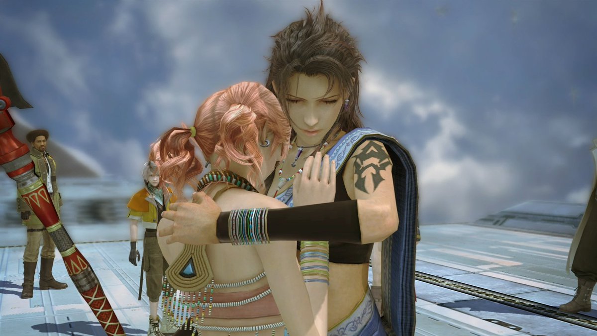
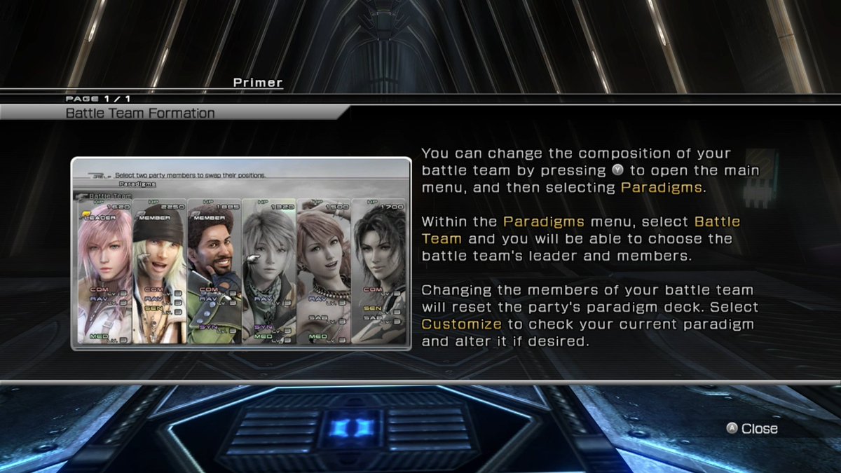
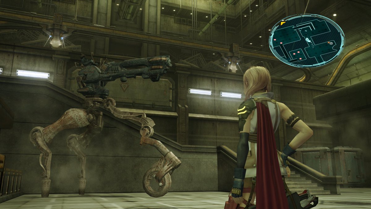
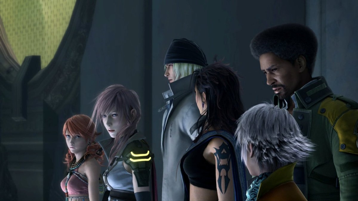
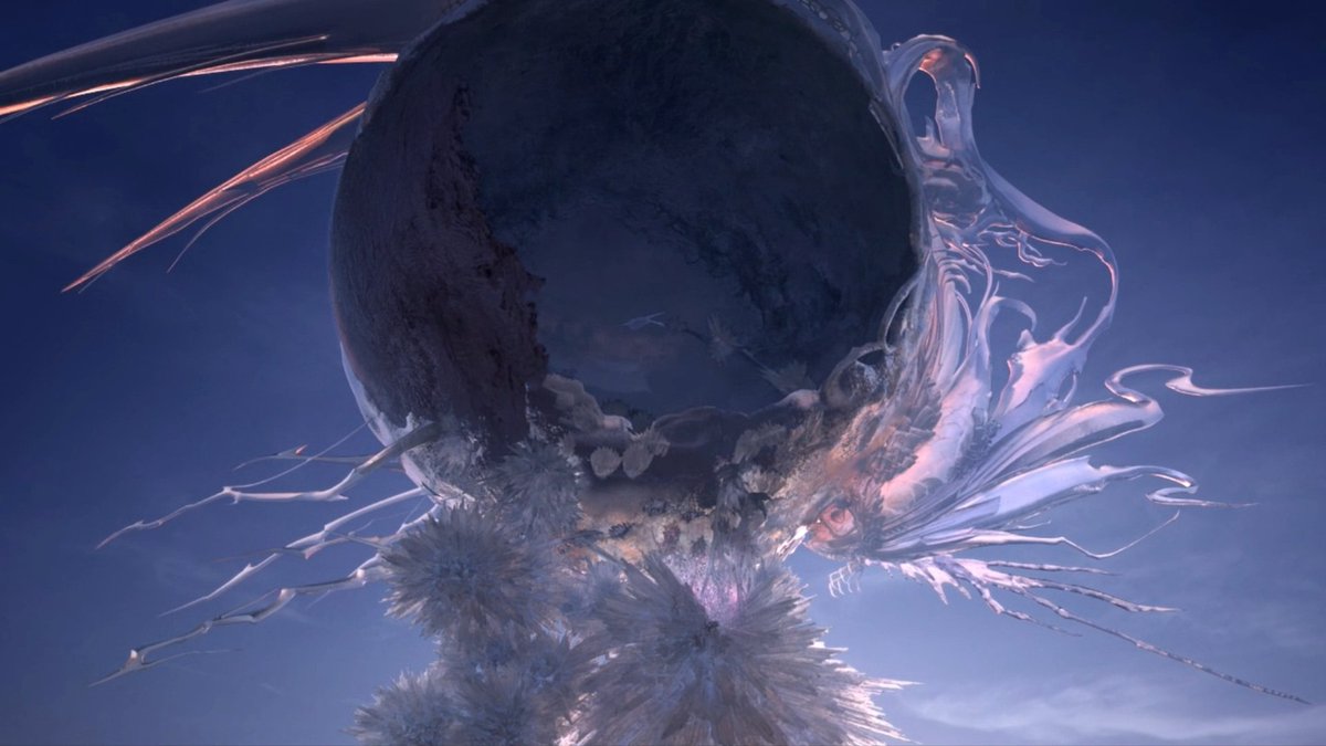
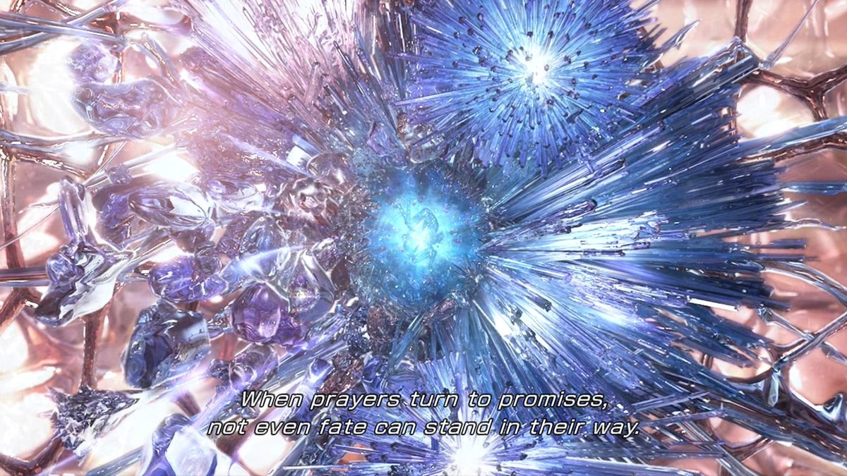
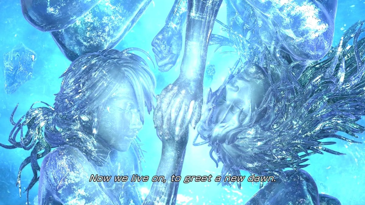
im gonna play Final Fantasy XIII (2009)
widely regarded as The Last One They Made Before The Roman Numerals Got Too Big For Anyone To Remember How Roman Numerals Work
this game is extremely good, as proven by the fact that everyone on /r/gaming in 2010 fucking hated it
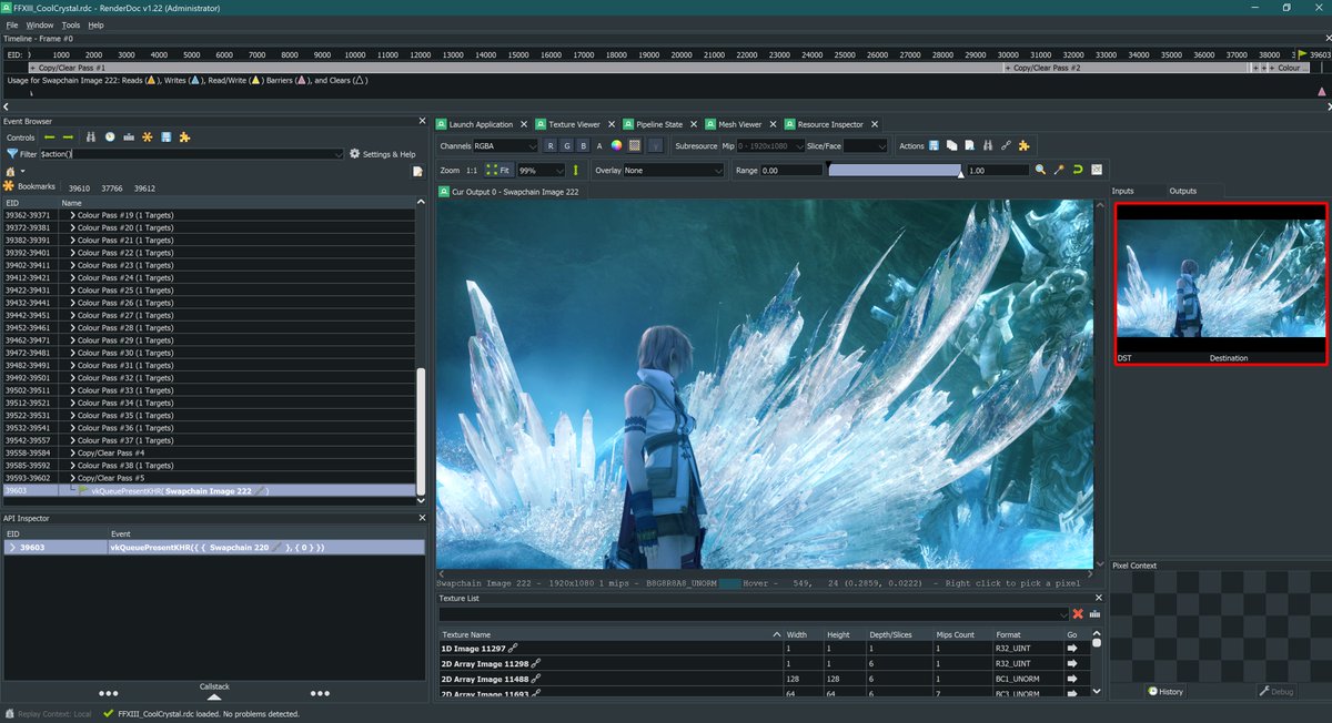
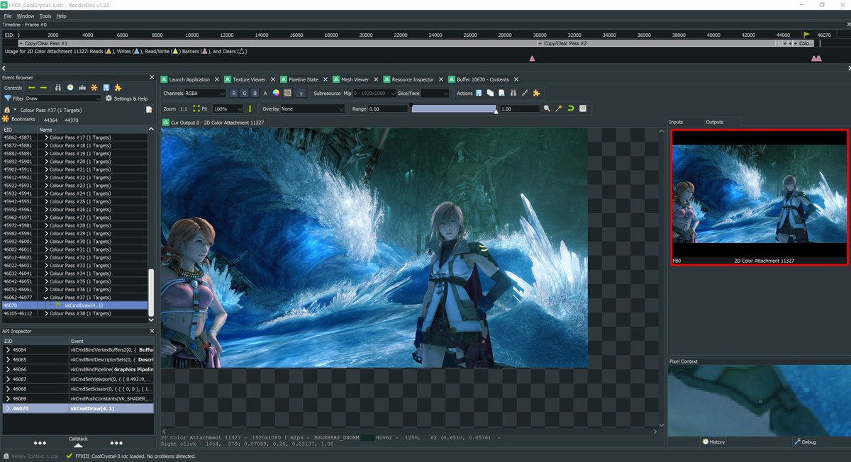
Playing the PC version bc I've kind of always wanted to see what this game looks like in renderdoc. Hopefully I can get that working at some point
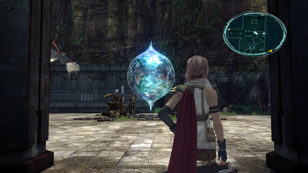
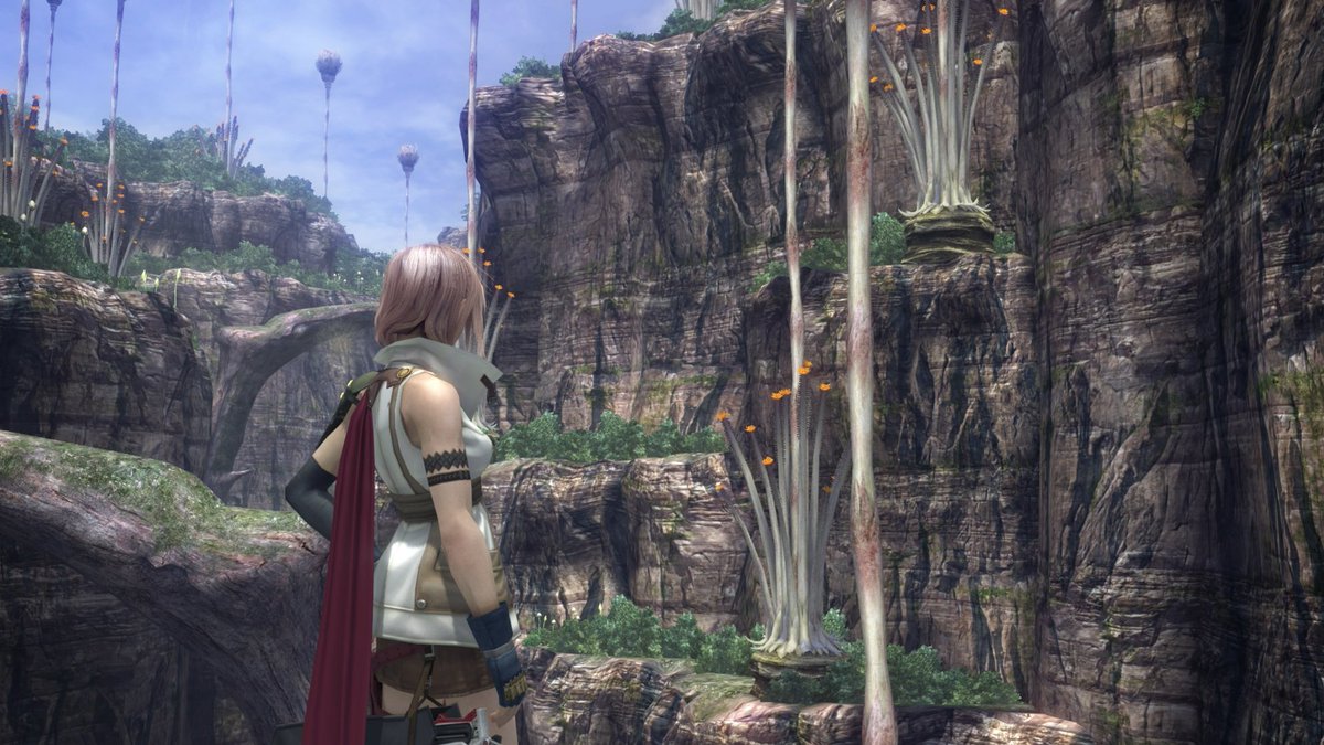
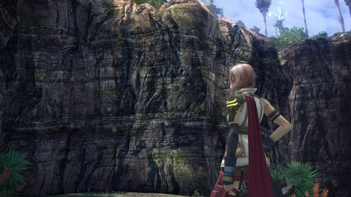
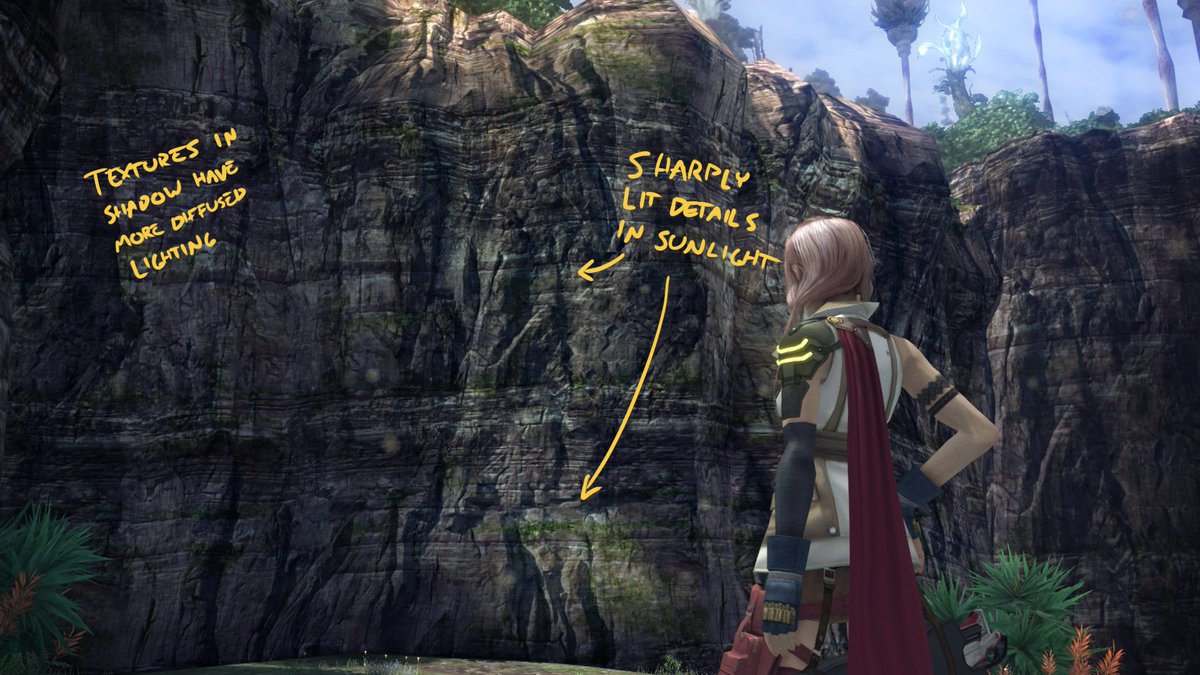
Shadow filtering seems to be broken/nonexistent on PC but tbh I don't know if that's the port's fault or if the PS3 never had it
also as much as I love old hardware, I don't have a PS3 have yall ever tried using a 360 in the Present Day?? Basically the last thing microsoft did before retiring the console was completely ruin the launcher so it's utterly miserable to use now lol
love trying to play a videogame and having to click through fifteen screens of ads while an omnipresent kinect avatar performs nauseating dances
The New Xbox Experience absolutely nailed the Mark Zuckerberg Virtual Reality Teleconference Purgatory aesthetic fully a decade early
wonder if you can hack a 360 to retvrn to THE BLADES
...anyway, final fantasy
okay actually now I'm googling whether you can get THE BLADES back on an old 360 and the answer is a solid "probably" if you have an old enough hardware revision but step 1 is "solder a raspberry pi onto the JTAG pads on the motherboard" so uhhh looks like a wild ride
also: oh yeah remember the red ring of death
nearly every blades-era 360 ever manufactured eventually melted itself so apparently they're Extremely Rare now lol
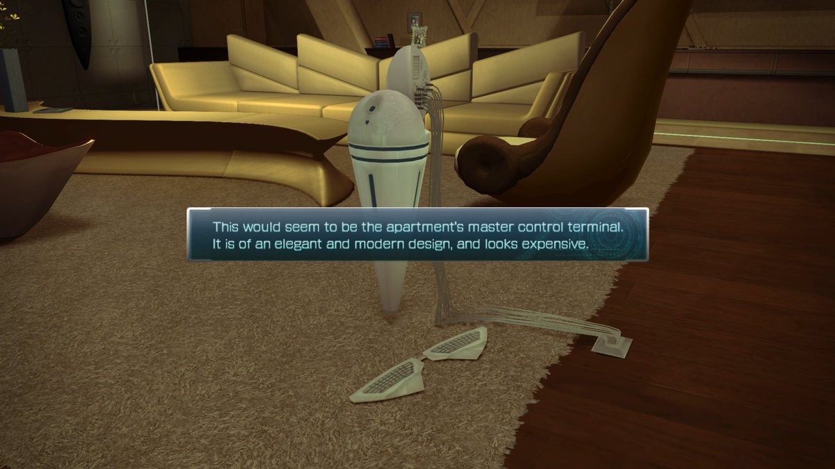
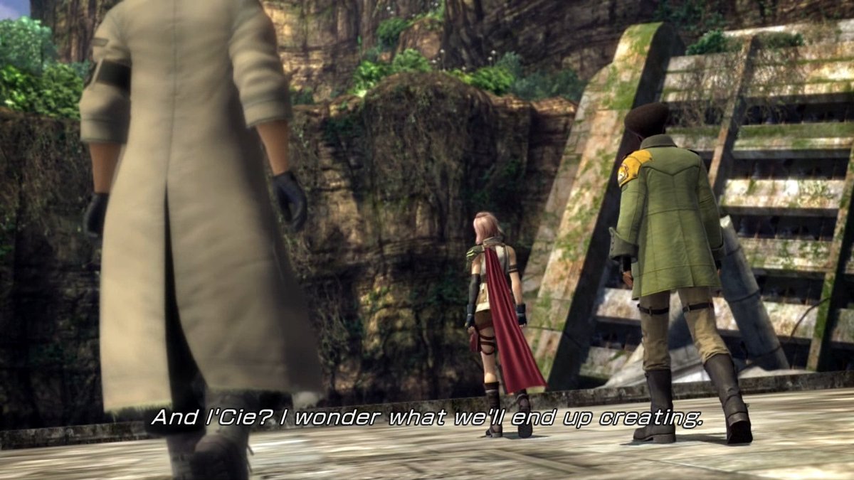
oh hell yeah this is so needlessly expensive
this entire cutscene is just "the gang rides a platform" but they're casually pushing buttons and moving levers on this giant construction machine and it's all totally bespoke animation for no reason
it's incredible that square made it to like 2016 without ever realizing you're supposed to have producers and they're supposed to prioritize tasks for the artists
secret to gamedev success: just let your artists just do whatever and go insane polishing things no one will ever see and also have so much money left over from the 90s that you can just keep doing this for basically forever
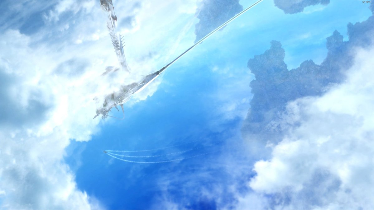
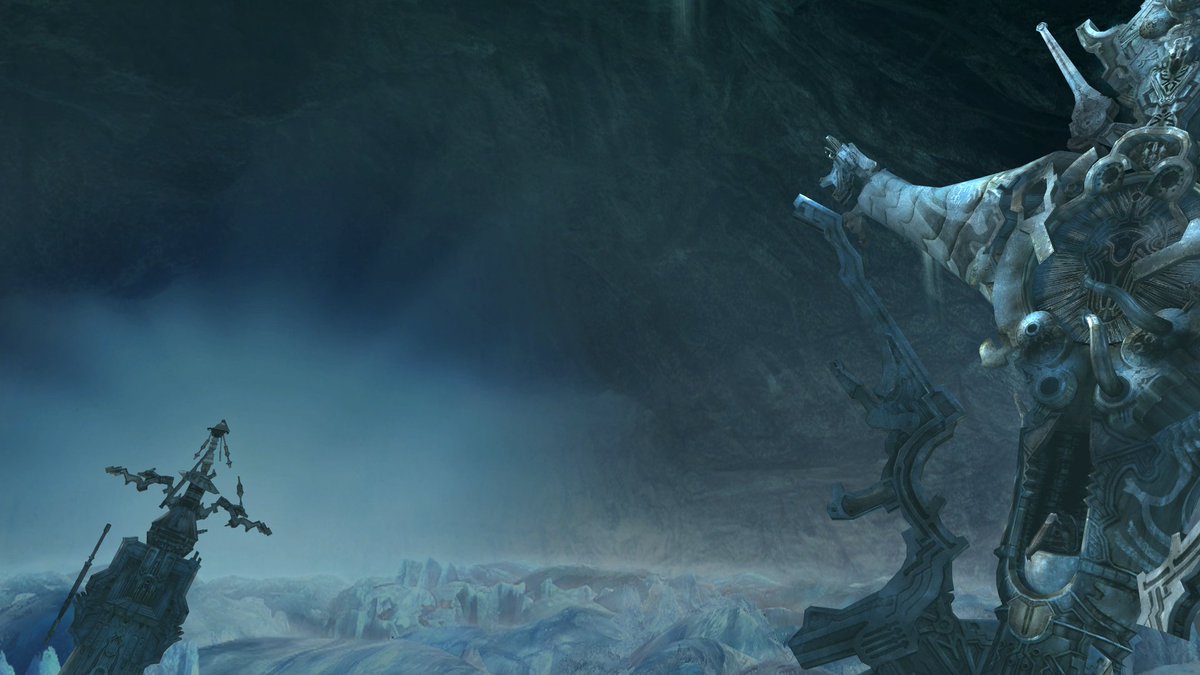
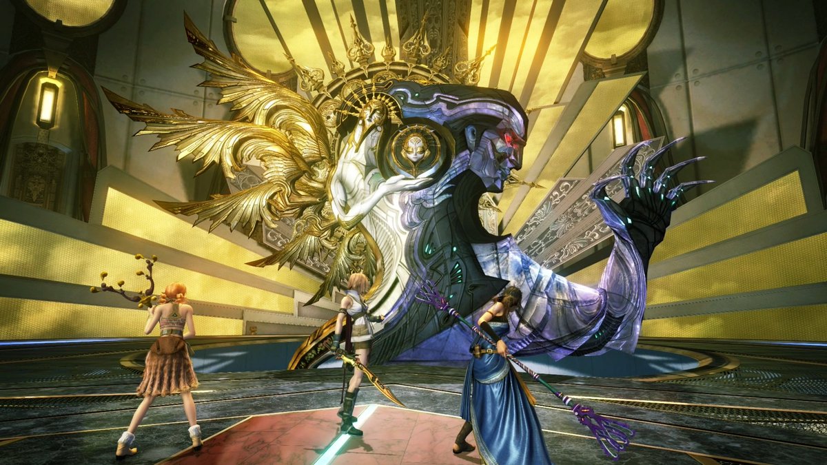
It rules how the gods are like physically present in the world and everything seemingly revolves around them, but every time you actually SEE one it's like a thousand-foot-tall fucked up sculpture being hauled around by military helicopters
it's been ten years since I played this originally, so I've forgotten most of it
IIRC though most of the plot is barely comprehensible, but it's like that BECAUSE the gods are alien and incomprehensible, and then their inscrutability is used to reinforce power
vanille's weapon is four whips attached to a set of antlers on a stick, which she finds behind a rock
it is now time for The Girl Run Cycle
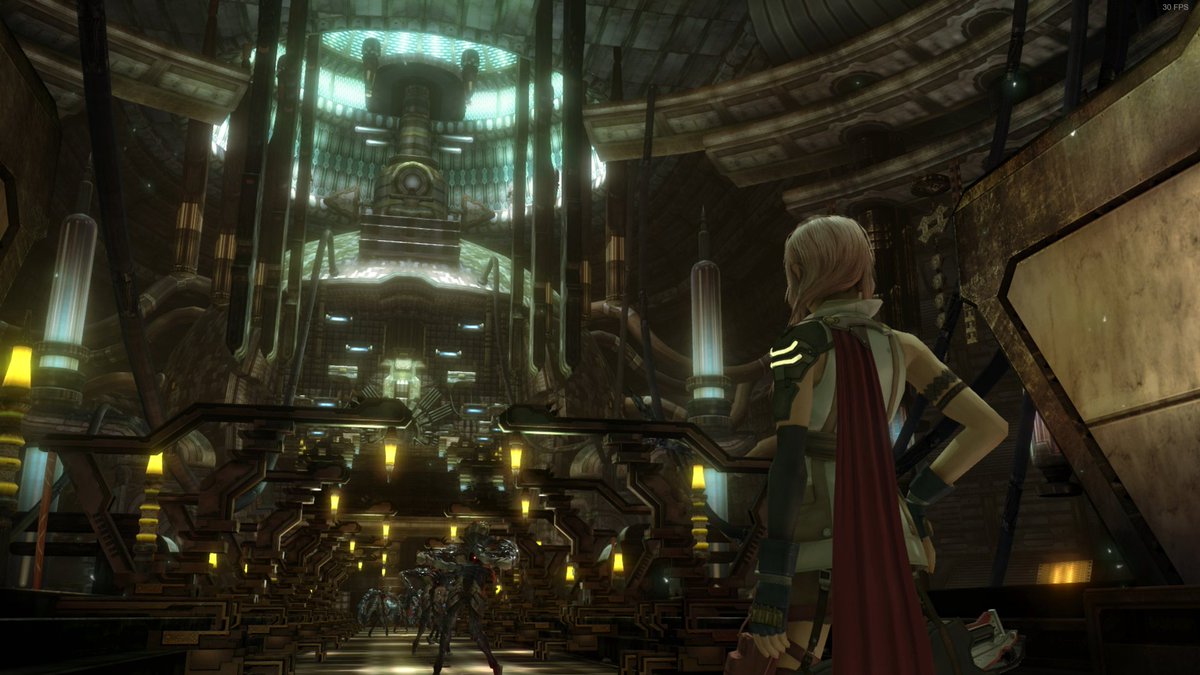
the design of this first dungeon is really cool
it keeps swapping between three groups of characters, who don't know each other and all arrived here independently, and they're all accidentally unlocking doors for each other so everyone's proceeding forward in parallel
lmaooo this rules
there are several different cornering animations for different speeds and radii
for the fastest/tightest one she does a little hop, and you can kind of jank it up by jiggling the stick in certain ways
if you do it a few times she gets dizzy and stops lol
What If Halo But Orb
serah doomed to her time-traveling greek tragedy arc meanwhile lightning's playing majora's mask ten million years in the future like I AM GOING TO KEEP MURDERING GODS UNTIL EITHER MORALE IMPROVES OR I RUN OUT OF GODS
you should play the final fantasy 13 sequels they are very good and also batshit
really curious how much of that is baked light simulation, or if the artists just went in and hand-painted vertex colors until it looked perfect
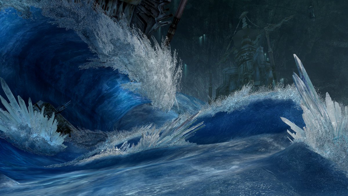
This area was one of the main reasons I'm hoping I can get renderdoc hooked up at some point
like how the hell is this a 360 game
okay I just spent the last 3 hours failing to get a gpu capture lmao
worked out how to launch it without steam breaking renderdoc, eventually realized it's dx9 and thus incompatible, finally got it hooked via DXVK dx9->vulkan shim, but trying to record a capture crashes the game
tried nsight with the DXVK trick too, but it turns out nsight doesn't support 32-bit apps at all lol
only option I haven't tried at this point is installing visual studio 2017 and one of the old-ass versions of the nsight plugin that still supported d3d9
i am going to bed now
big thanks to @PlunkOrg for pointing me towards GFXReconstruct
extremely cool utility that records *every vulkan API call* into a big stream of frames, which can then be played back on the gpu without involving the actual videogame
then you can hook THAT with renderdoc lol
I got a few captures of this area but tbh I might not be able to get any from anywhere else in the game
this entire process has like ten thousand failure points; I spent 2 days on this and got it working for like 30 minutes and then it stopped working for no obvious reason lol
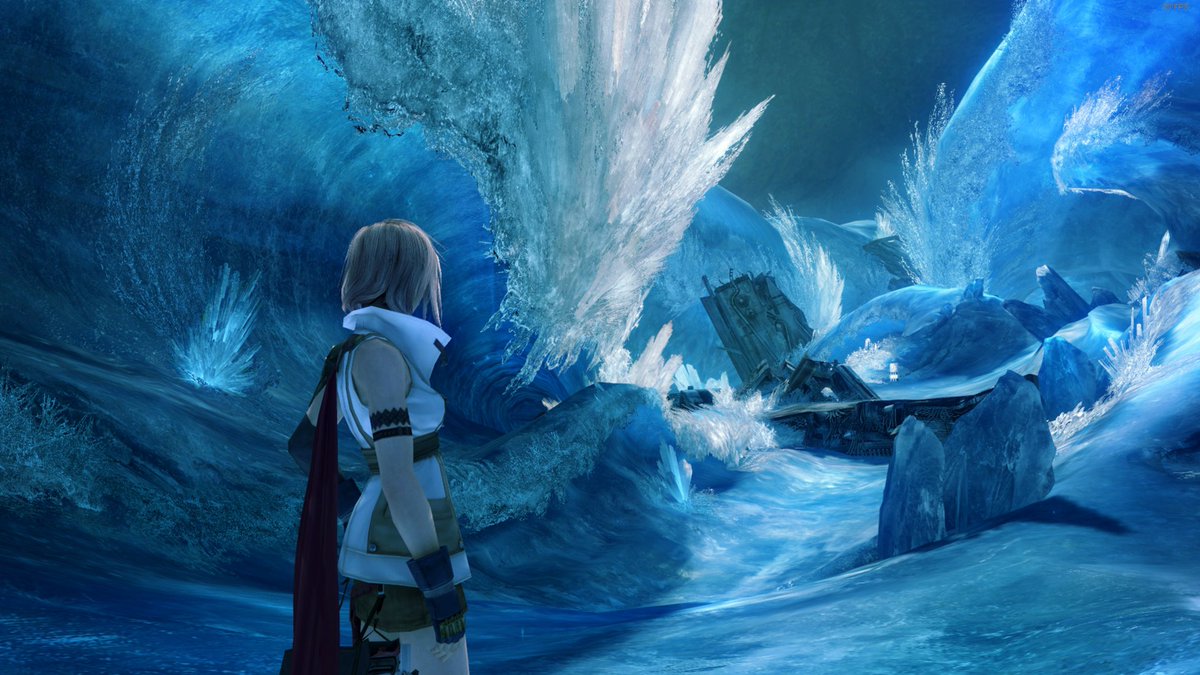
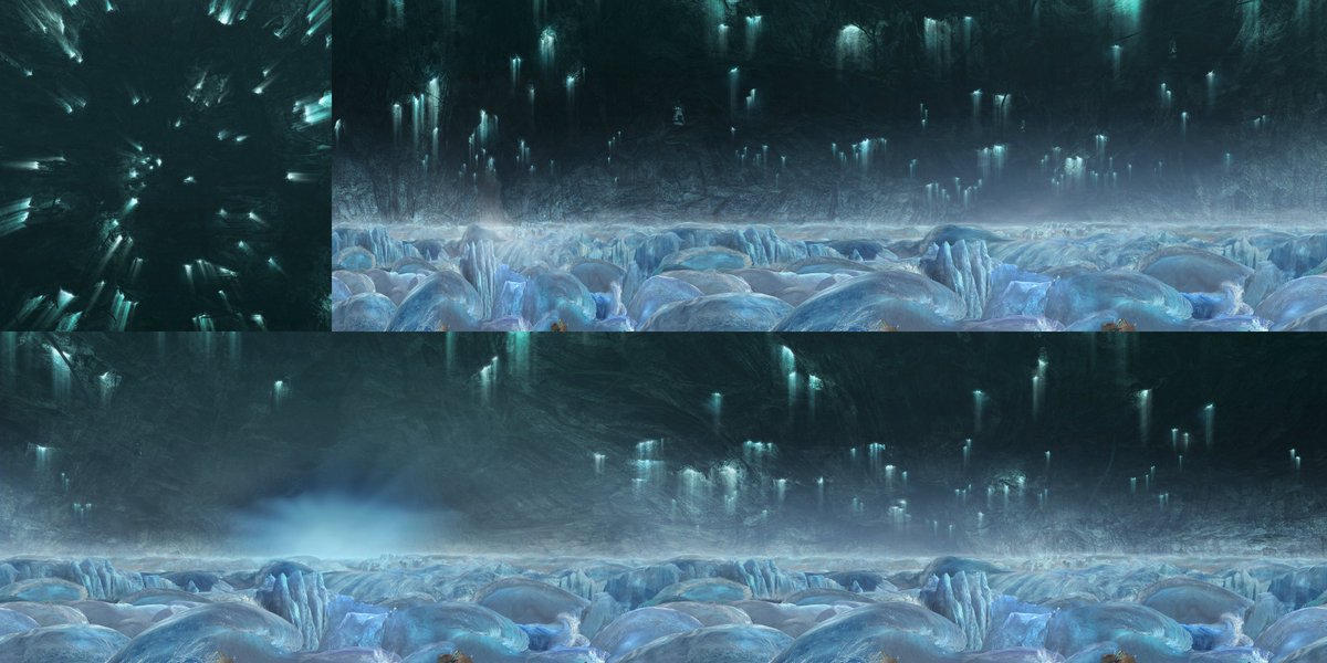
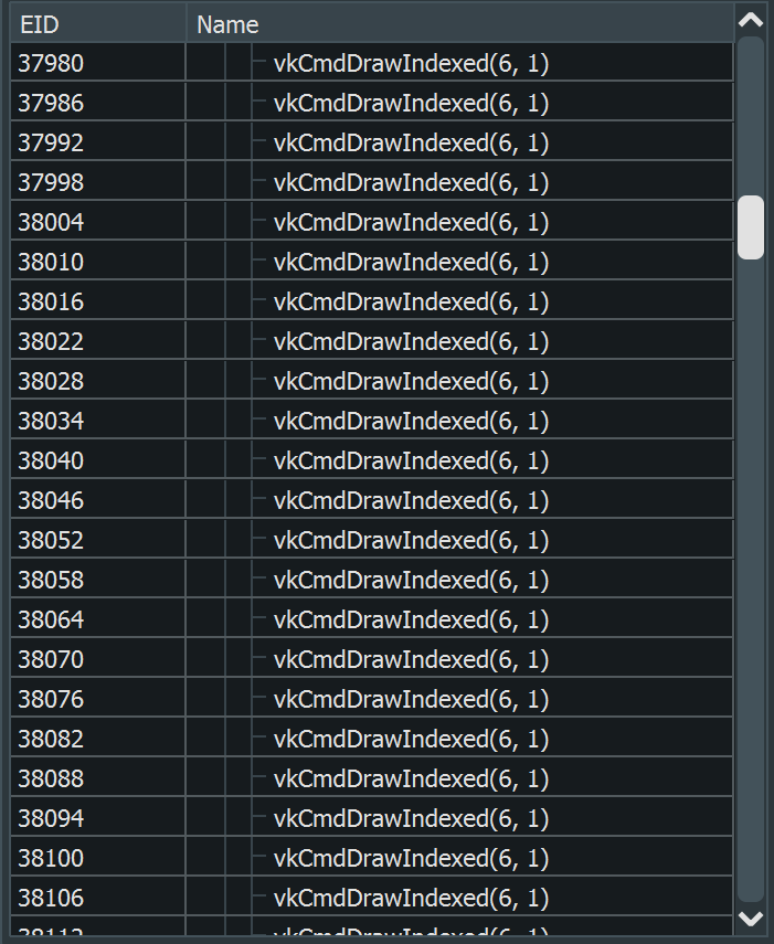
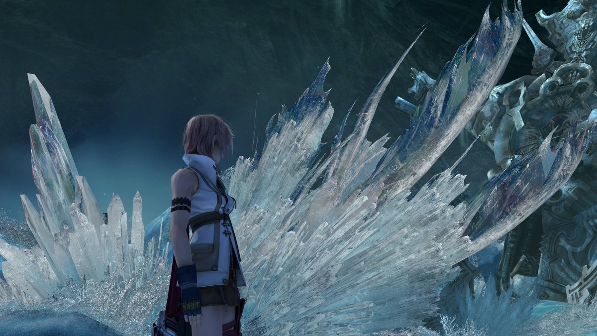
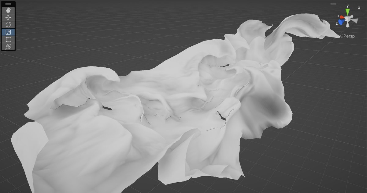
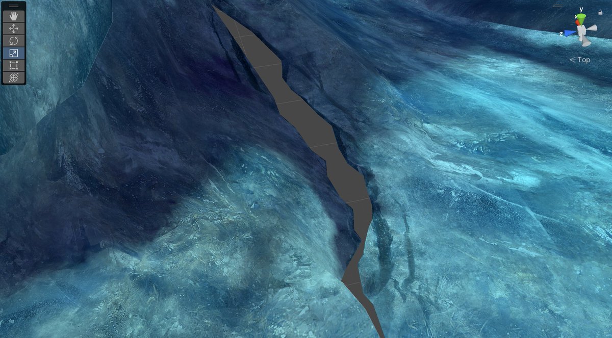
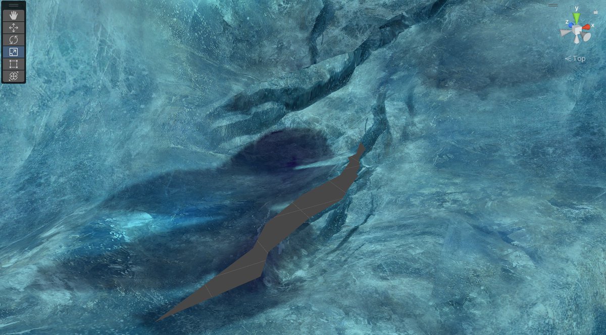
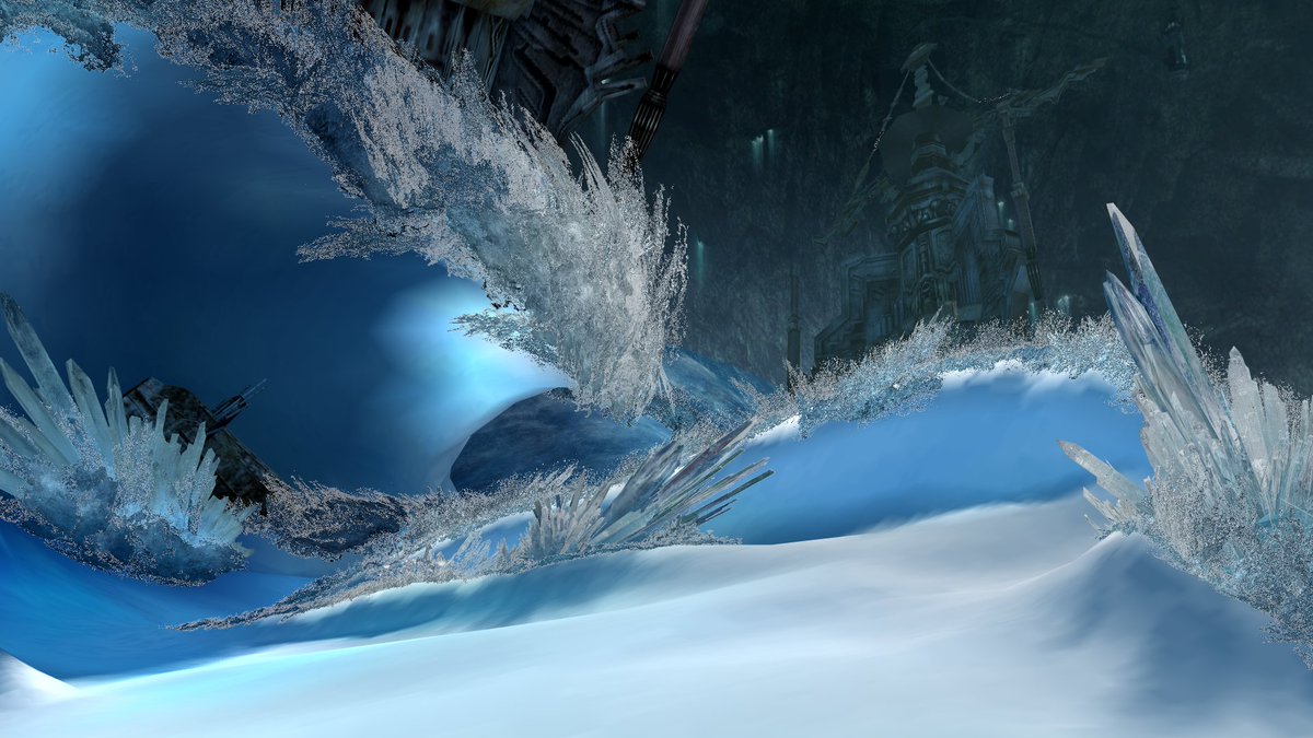
Okay! Here's the bulk of geometry rendering, not including particle effects and postprocessing:
Surprising no one: it's a completely ordinary forward renderer, no HDR, no PBR, no AO, no color grading, minimal postprocessing (bloom, zoom-blur light shafts, DoF in cutscenes)
the character shaders are pretty fancy, but even then it's still all single-pass forward rendering
gonna dig into some details but the tl;dr for "why does this game look so good" is basically just "because the artists did an insanely good job" lol
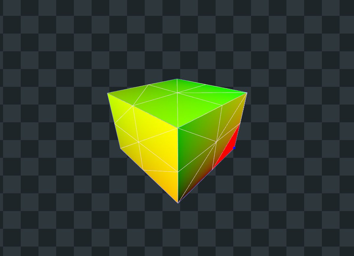
what if a zero was a Cube
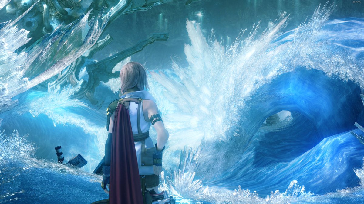
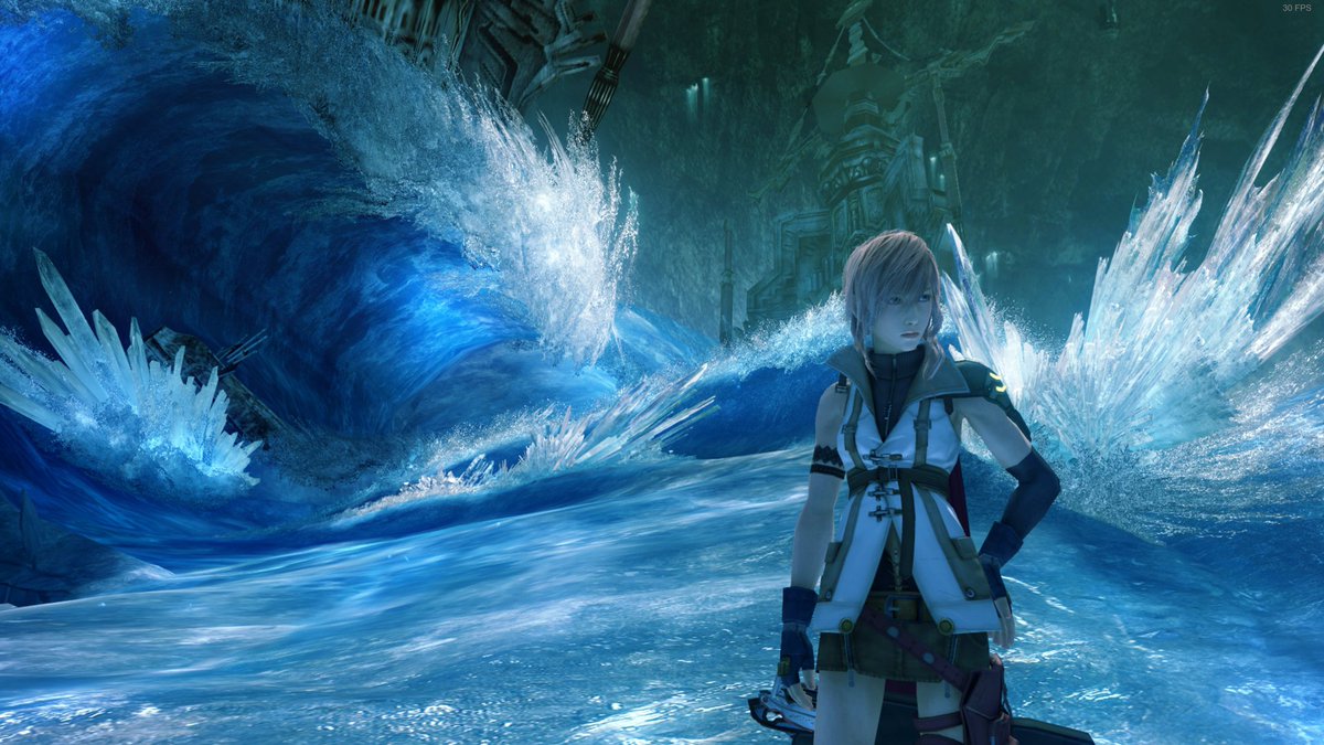
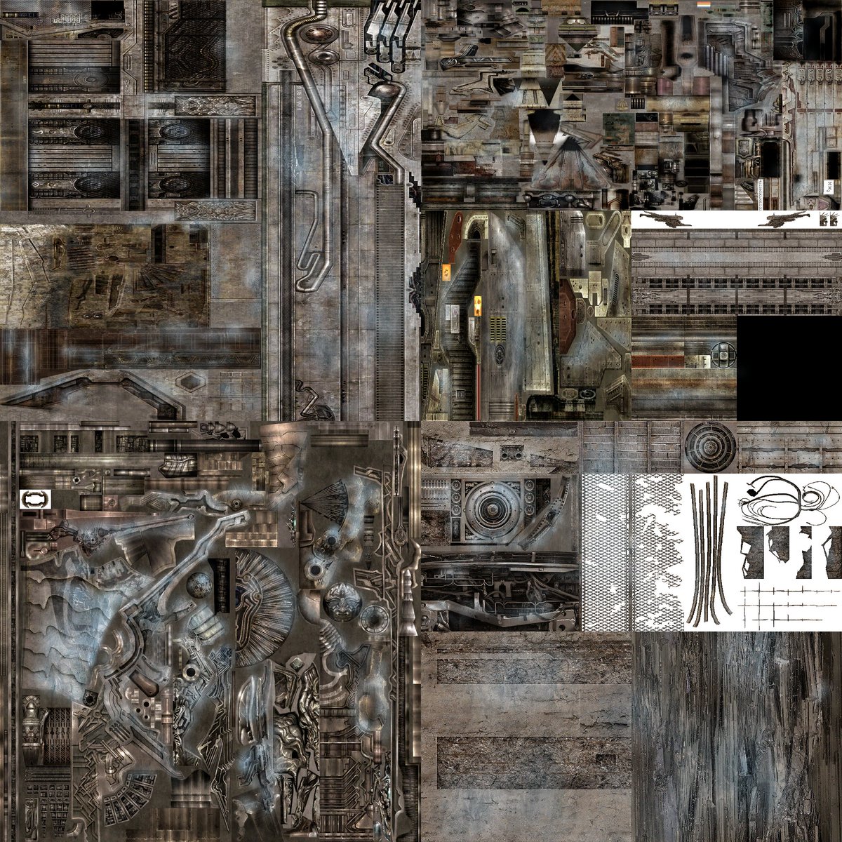
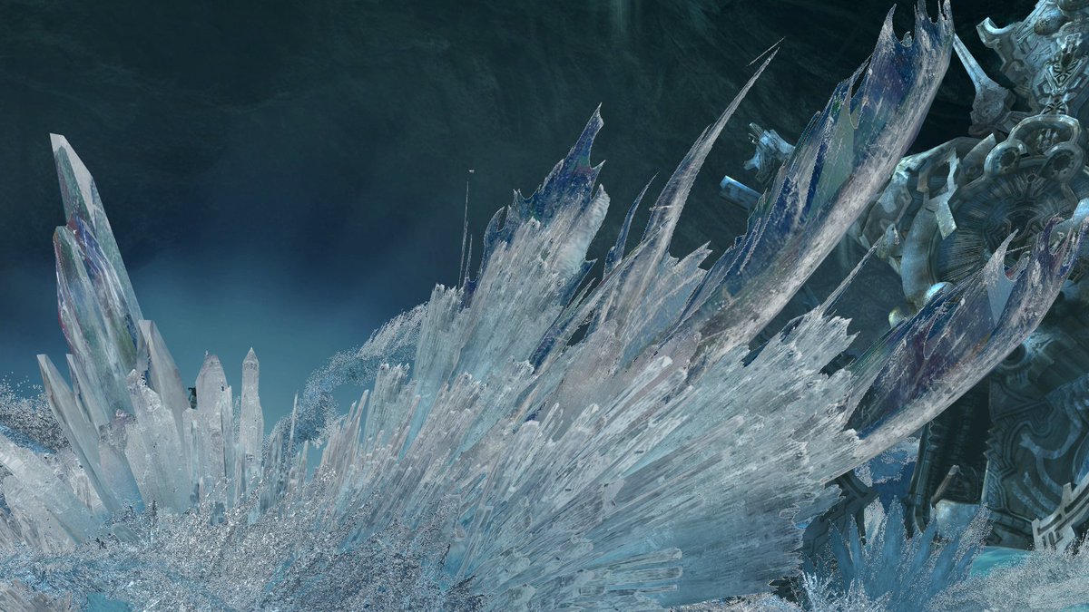
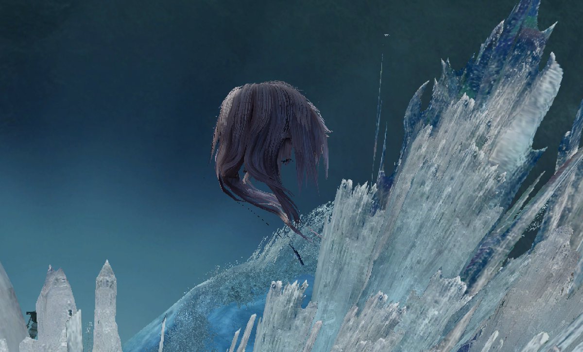
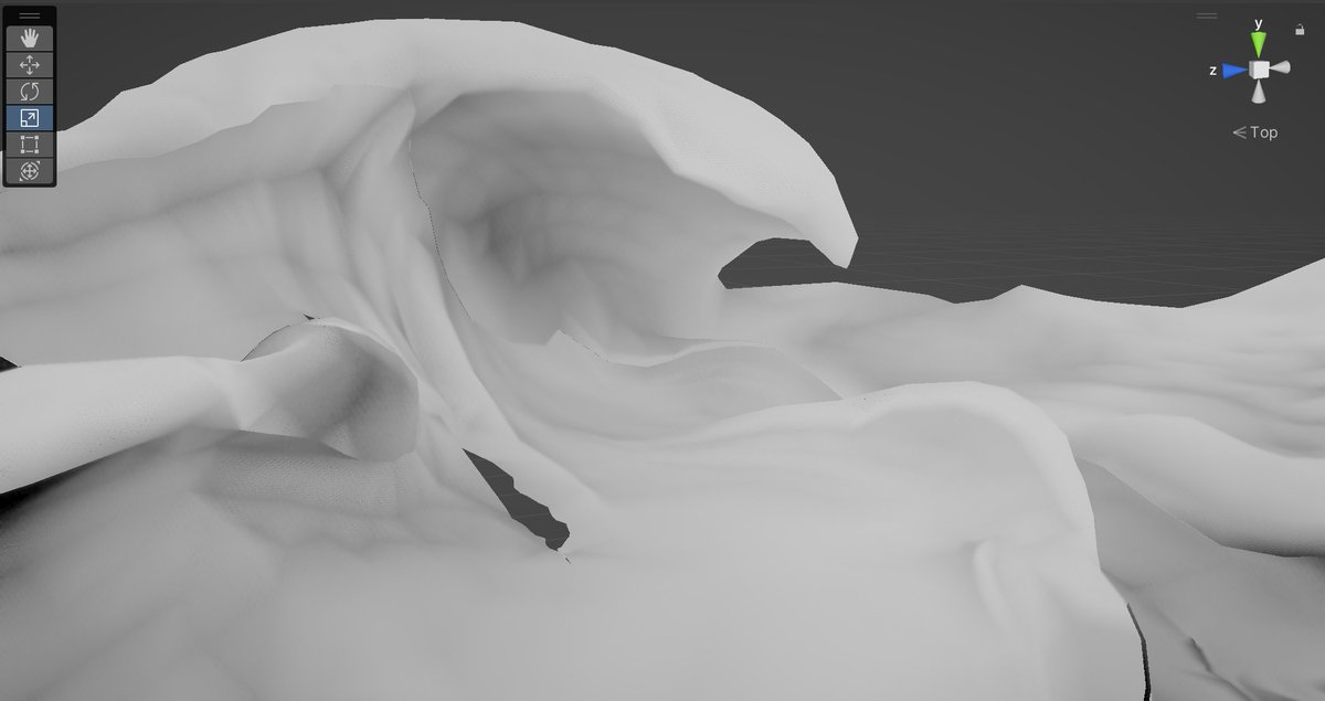
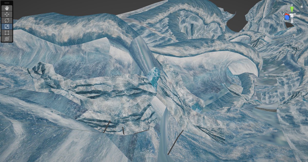
Next up is opaque rendering, which is.... basically everything except particles. The ice fins/cards and even the characters' hair is all opaque, using alpha-to-coverage pretty much everywhere
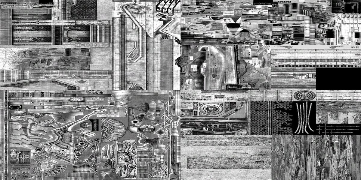
notably: NO NORMAL MAPS
there's basically no realtime lighting in this game, except on the characters (who do use normals)
baked lightmaps and detailed shading painted into the textures was good enough for the PS2 and it's good enough for 2009
tbh it's good enough for 2022 too
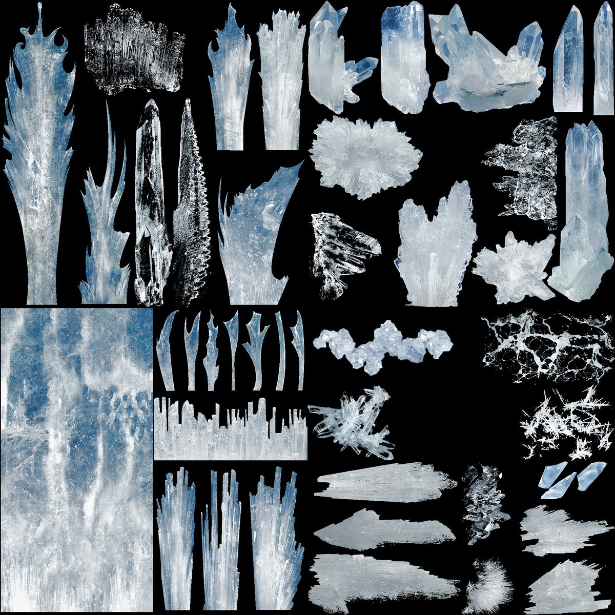
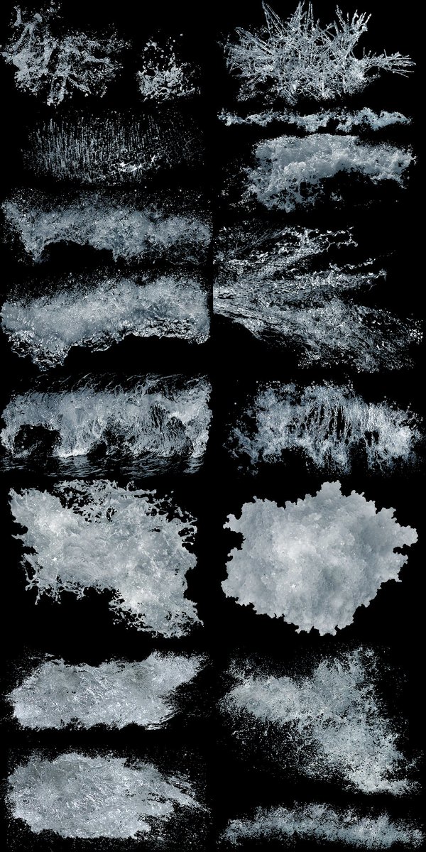
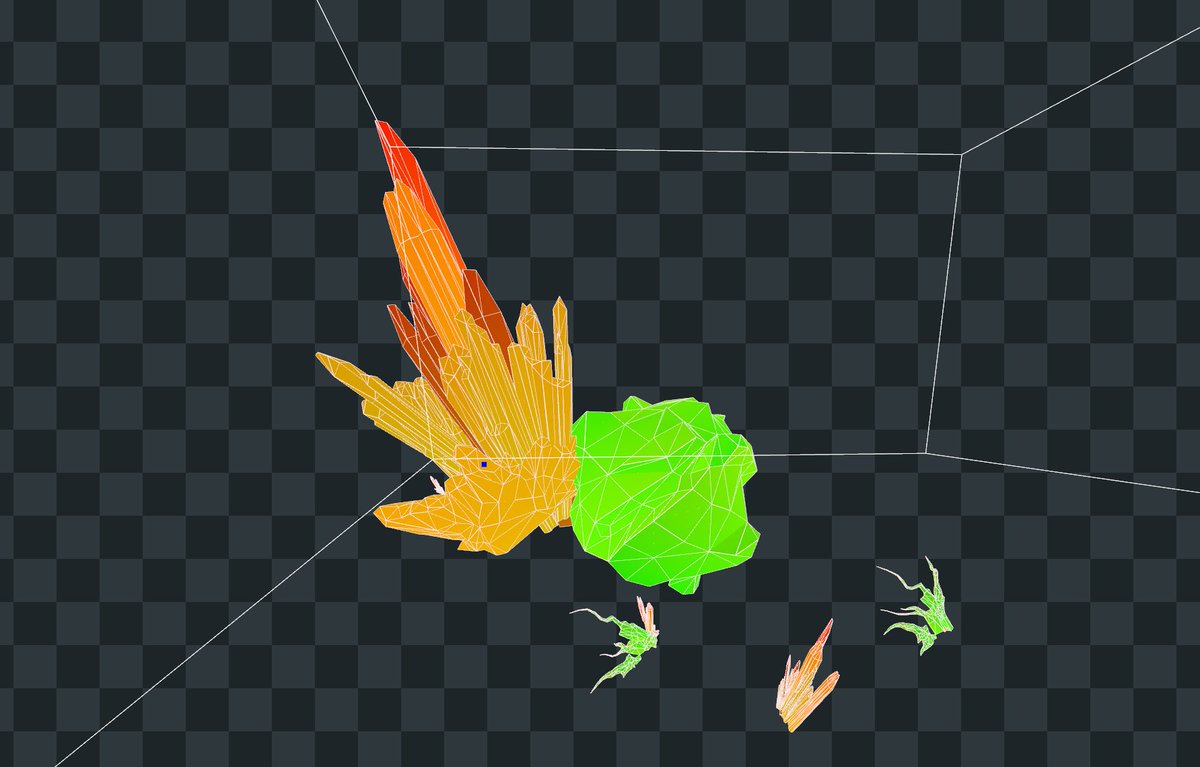
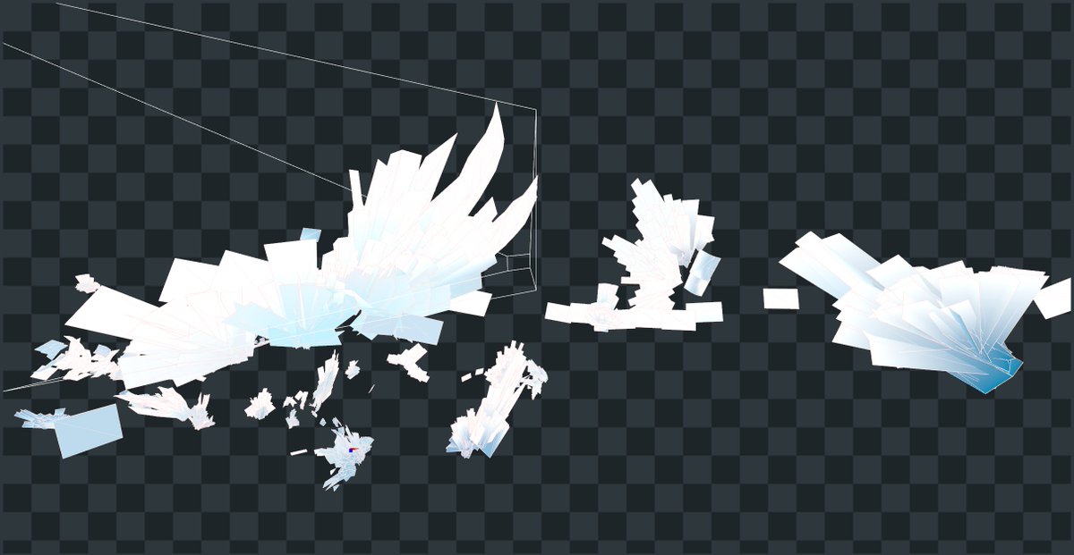
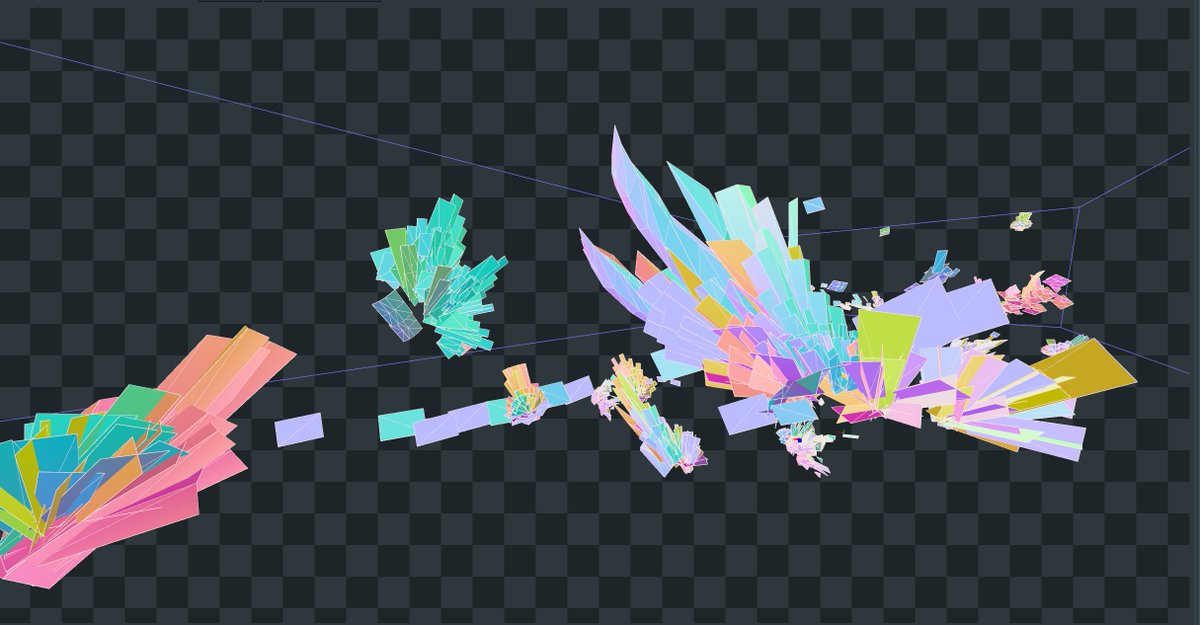
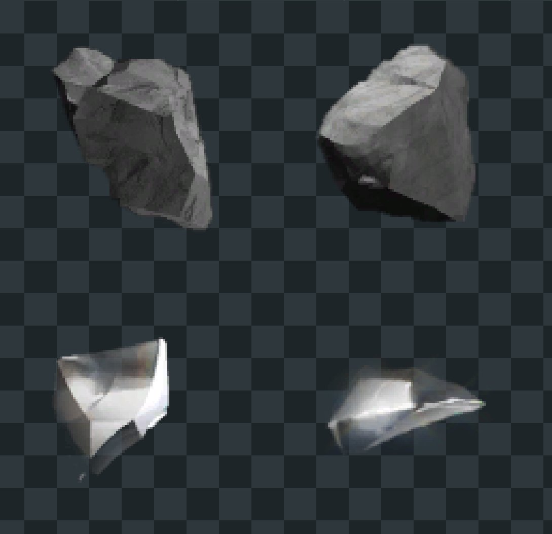
notably, all the crystal meshes are batched REALLY aggressively
almost every card in the whole level that uses that "spray" atlas is sent through in one draw call, which is like 8500 quads
all rendered with alpha-to-coverage
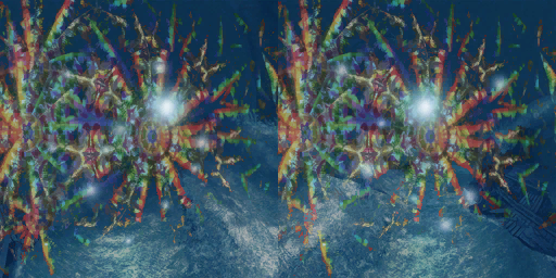
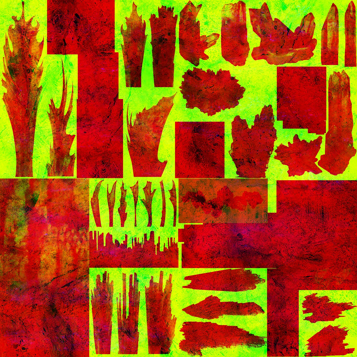
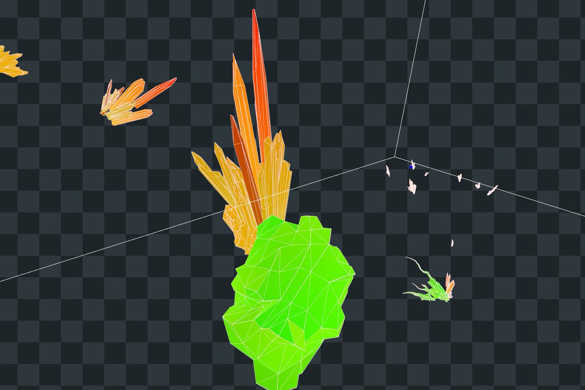
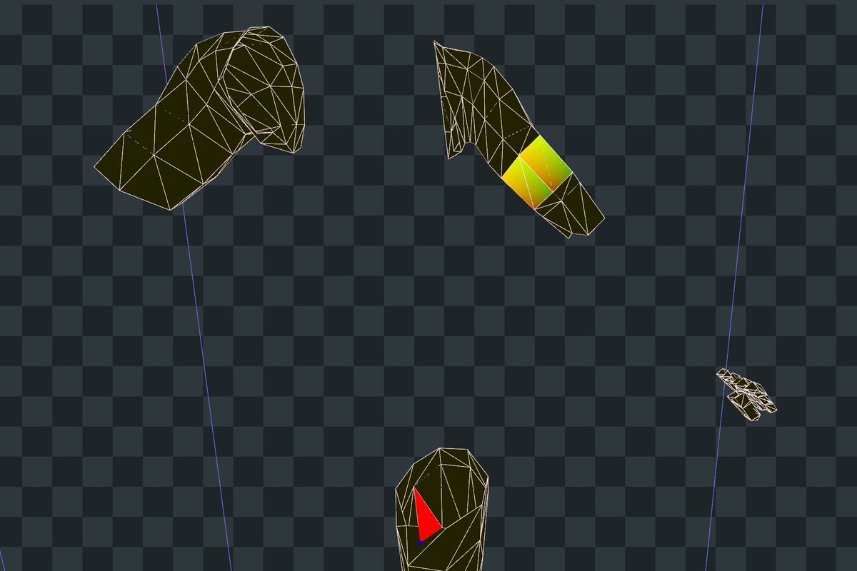
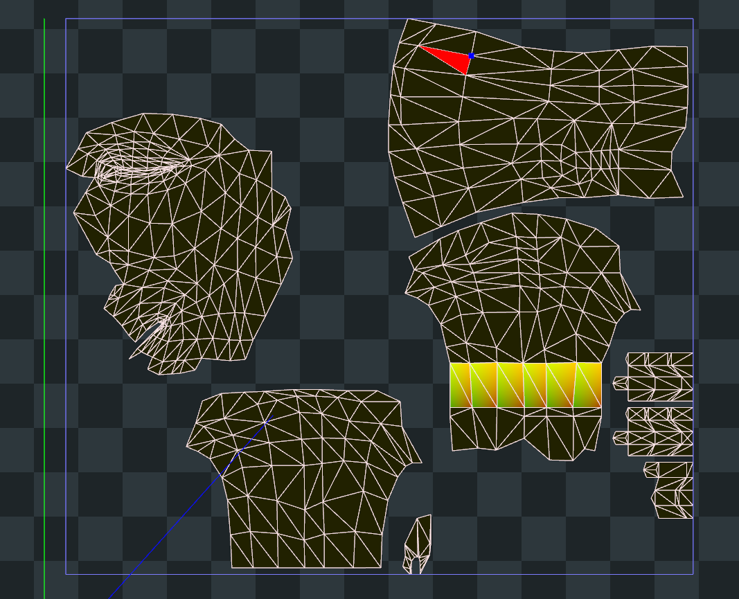
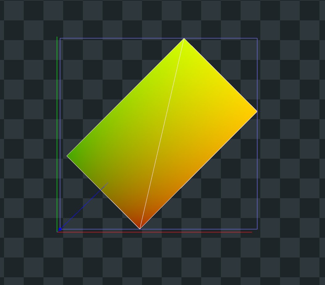
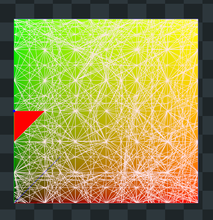
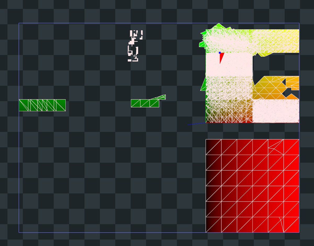
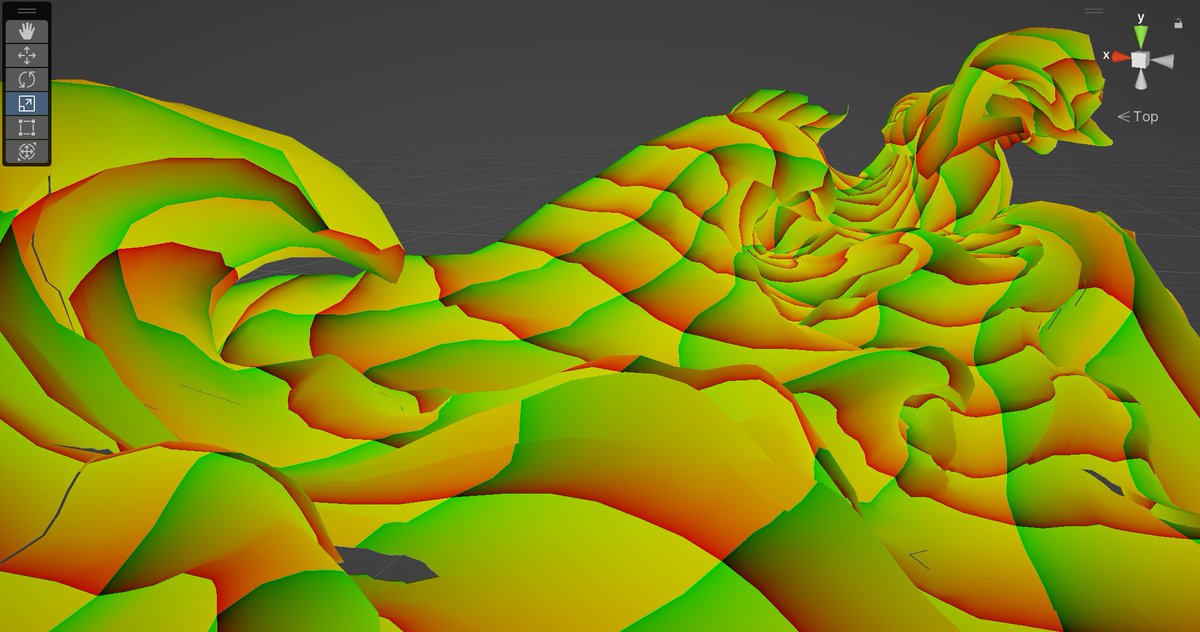
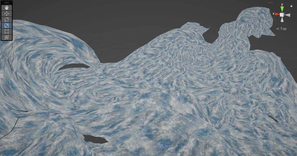
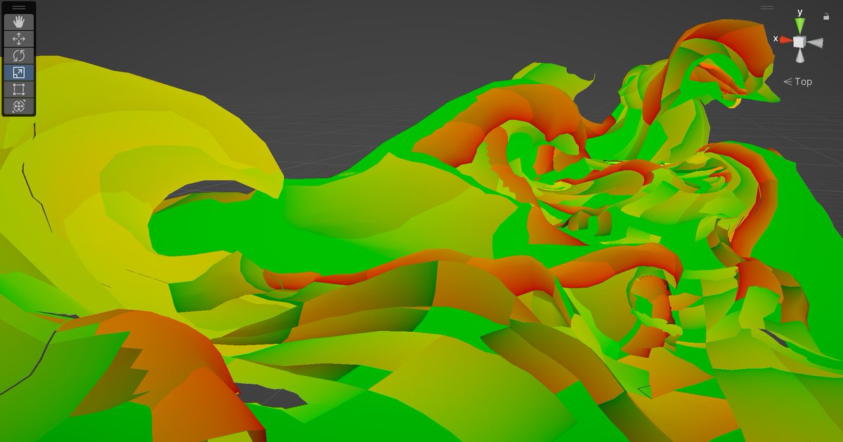
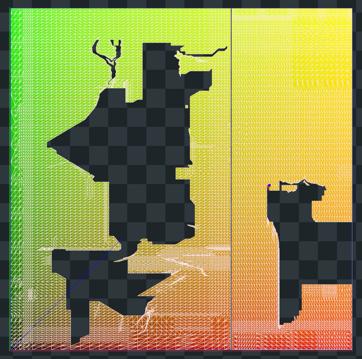
renderdoc doesn't provide a good way to visualize texture mapping on meshes, unfortunately
if you spend enough of your life staring at green-orange-red UV debug colors though, eventually you don't see the matrix code anymore
looking at it in motion, I totally thought it was refracting/distorting the background in some way, but nope
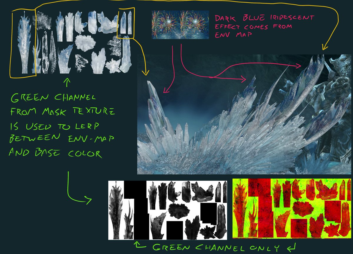
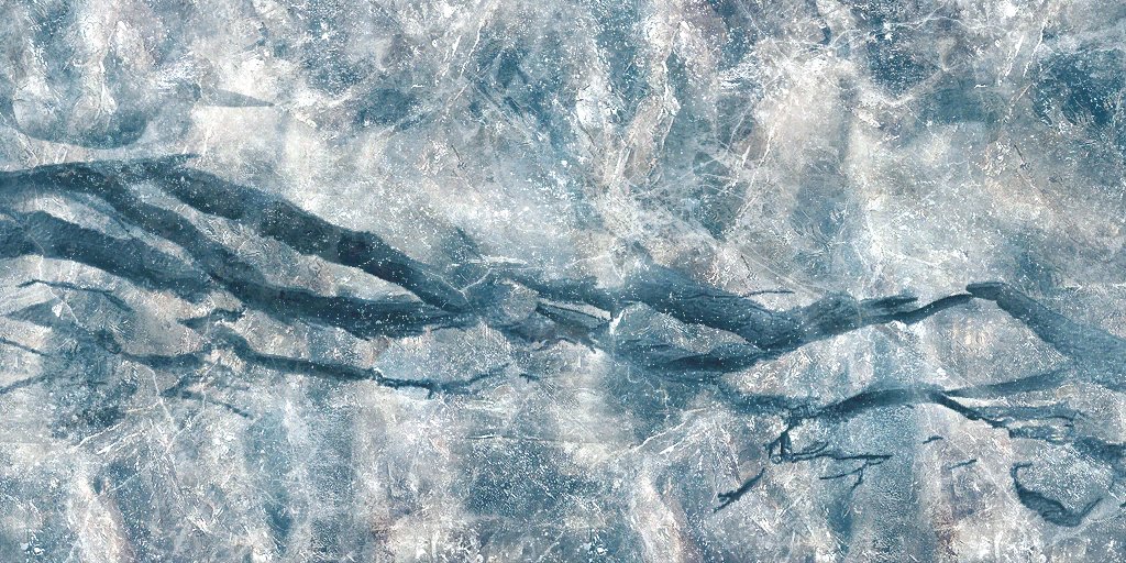
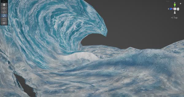
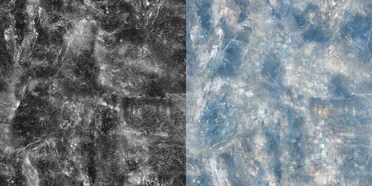
there IS no grabpass/scene texture! The only screenspace effects are post processes. The whole effect is just two textures modulated by a mask
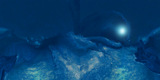
the actual 3D vector used for the envmap lookup COULD be fairly elaborate (reverse engineering fragment-shader math is pretty difficult even with renderdoc), but just from looking at it I don't think it's more complex than "refract the eye ray through the vertex normal"
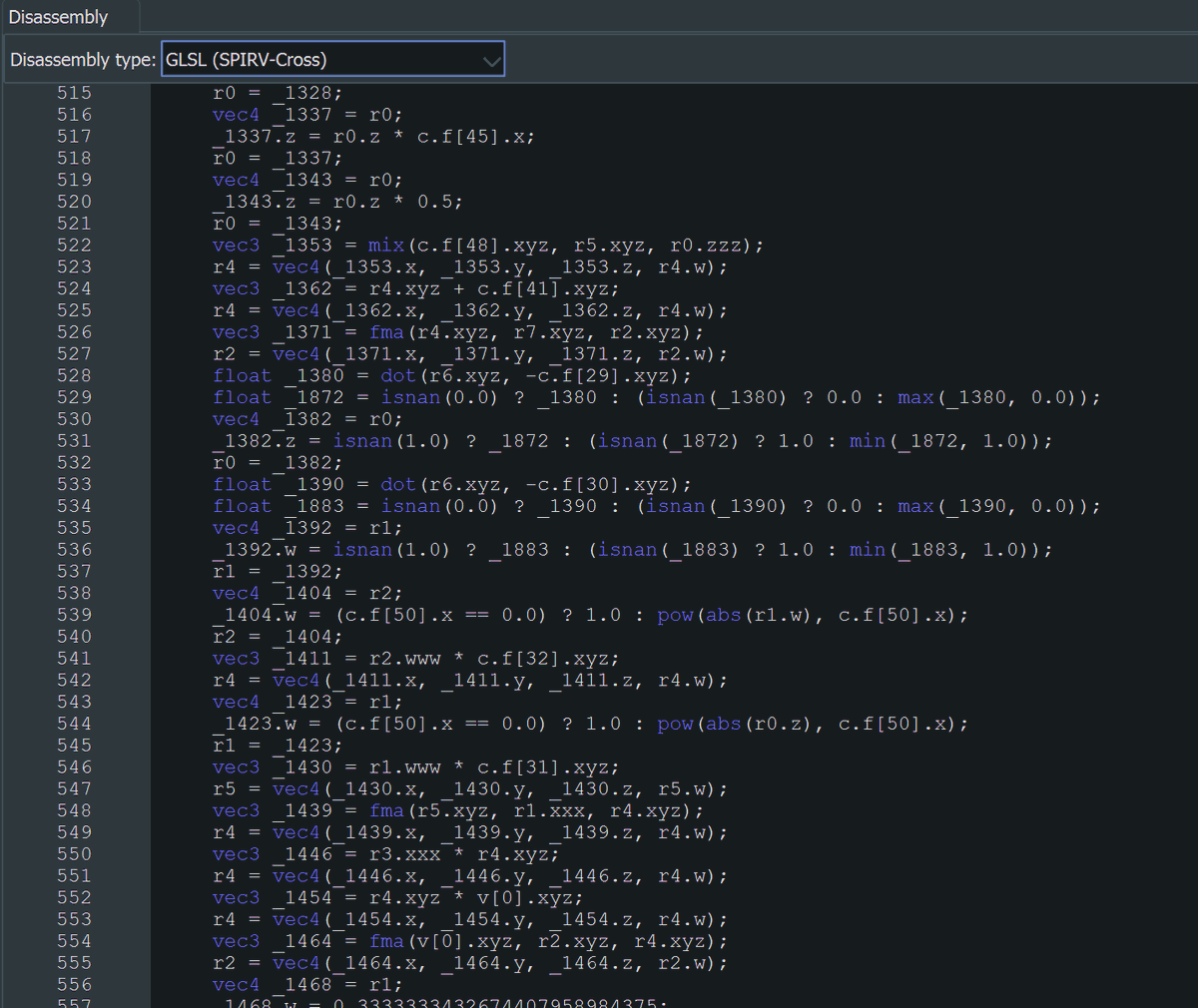
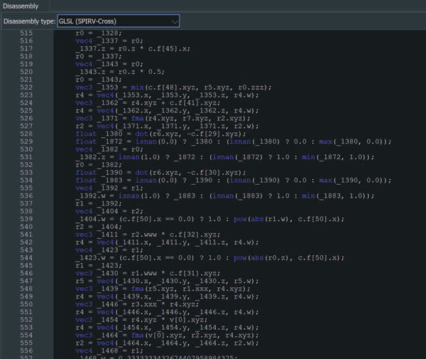
(reading decompiled SPIR-V (pronounced "spurve") is a nightmare BUT renderdoc can show you all the varyings passed *into* the frag shader, and in this case it looks a lot like world pos + view pos + world normal, which would be exactly what you'd need for refracted eye ray)
no tangents obv, since no normal maps
really wonder how much actual lighting is being done in the frag shader here. No lightmaps but it's def affected by the general blue-green ambient color. Ambient light seems to have a directional component, so probably needs normals for that
Notably though: this is all still single-pass forward rendering. No intermediate buffers or multi pass effects; it just draws the whole thing in one go with alpha-to-coverage
honestly this kind of "no energy conservation, just vibes" tech-art approach where everything's made of hand-authored masks and curves modulating parameters to nail a look is my fav part of graphics work
but then those nerds at disney invented PBR and now I have to do integrals
microfacet [derogatory]
upon further reflection, I think the horizontal flip might actually be from DXVK, to correct the handedness flip between d3d9 and vulkan
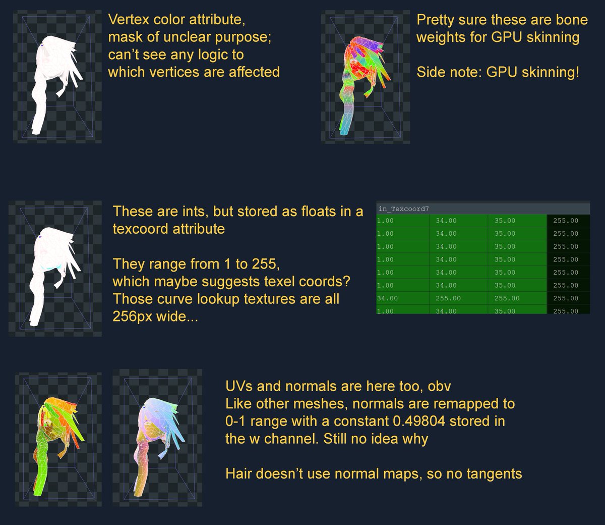
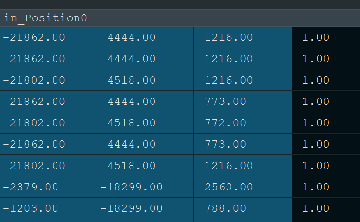
The range for vertex positions seems to be around +/- 28,000 and they're clearly ints
16-bit signed ints have a very similar range. Maybe the original game stored position attributes in 16bit ints, and either the PC port or DXVK turned them into floats later?
either that or Lightning's height is canonically like 55 kilometers
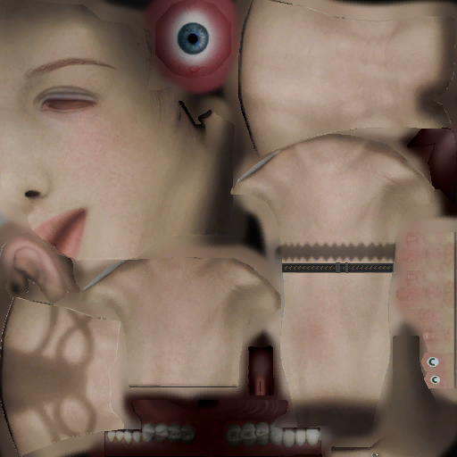
come to think of it: the face UVs are mirrored. How's normal mapping work on mirrored UVs? I've never had to think through this before lol, can you just invert the tangent vectors on the mirrored verts?
too tired to work out the math rn; maybe one of yall already knows
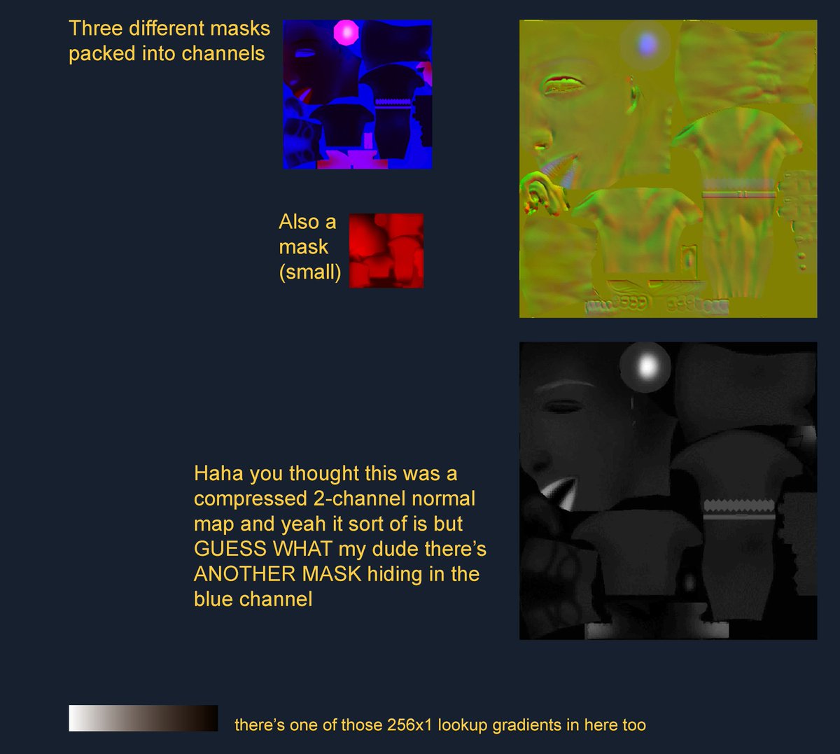
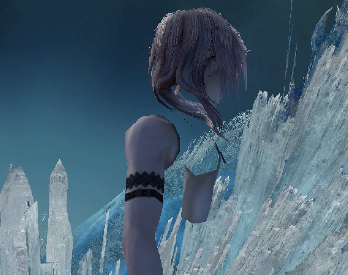
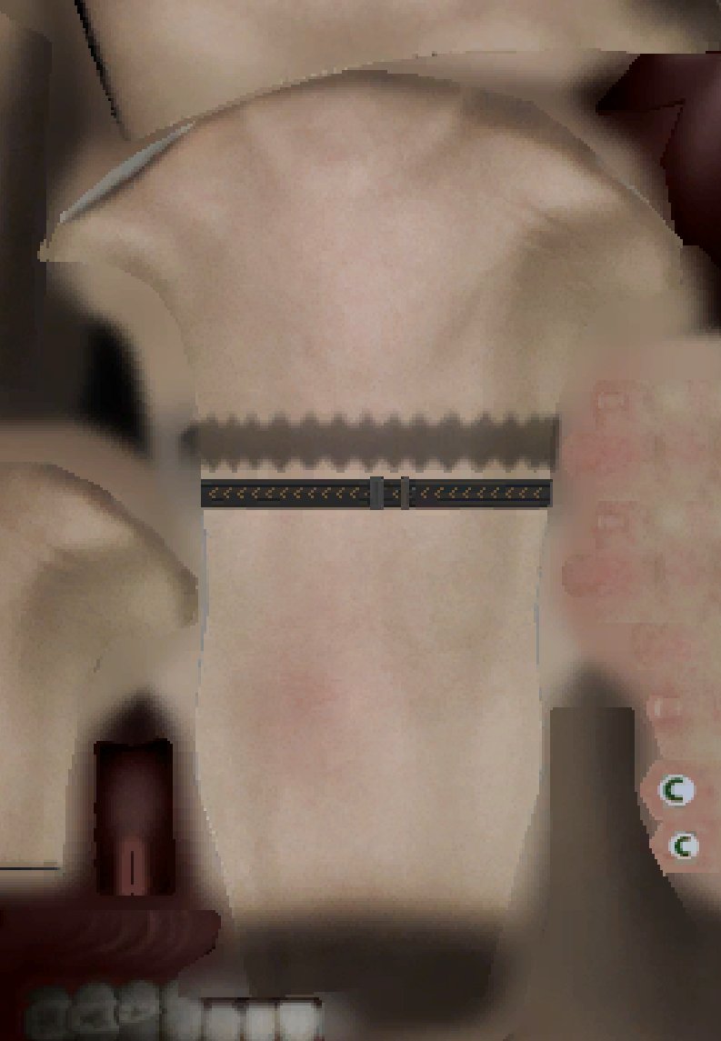
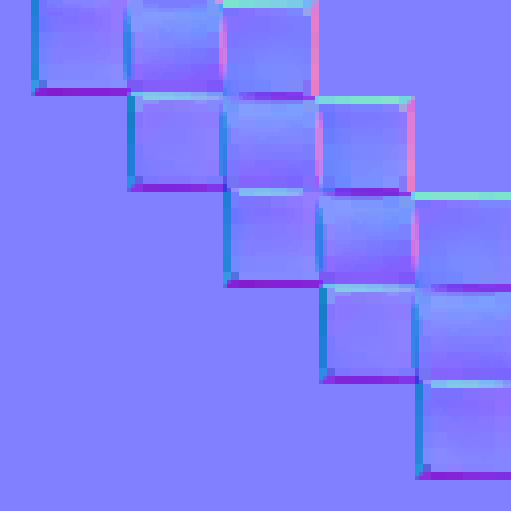
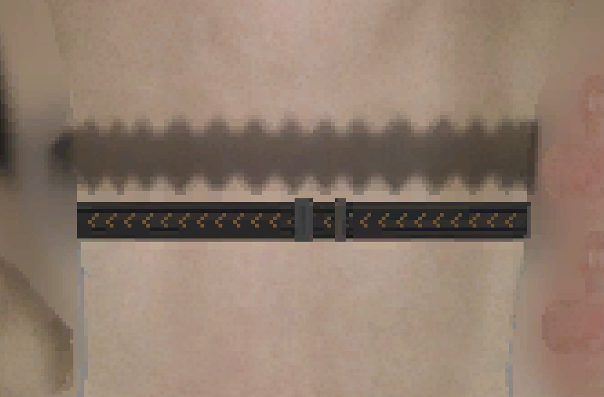
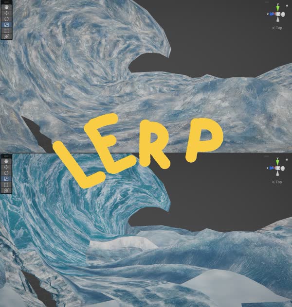
So the shader samples the regular color texture using the main UVs, and samples the bracelet textures, and then lerps between the two based on the bracelet mask
result is a perfectly localized area of sharp detail, blended over top of an area that uses a much lower texel density
One SUPER interesting detail I skipped earlier: While they're clearly not doing PBR, they ARE using pre-convolved reflection probes!
Like from an artistic standpoint, "everything is reflective; rougher objects just have blurrier reflections" is still really effective on its own
I really love this, because you don't necessarily NEED all the energy-conservation and metallic/dielectric BRDF stuff to make materials look good. You can arrive at the same blurred speculars and fresnel techniques just through observation and good artistic intuition
I have a pet theory that this is actually why we saw so much cheesy glowing-edges fresnel stuff in the early years of the 360 era
like a lot of it was obv "wow look SHADERS" but I think a lot of artists just intuitively GOT the fact that most stuff gets shinier at grazing angles
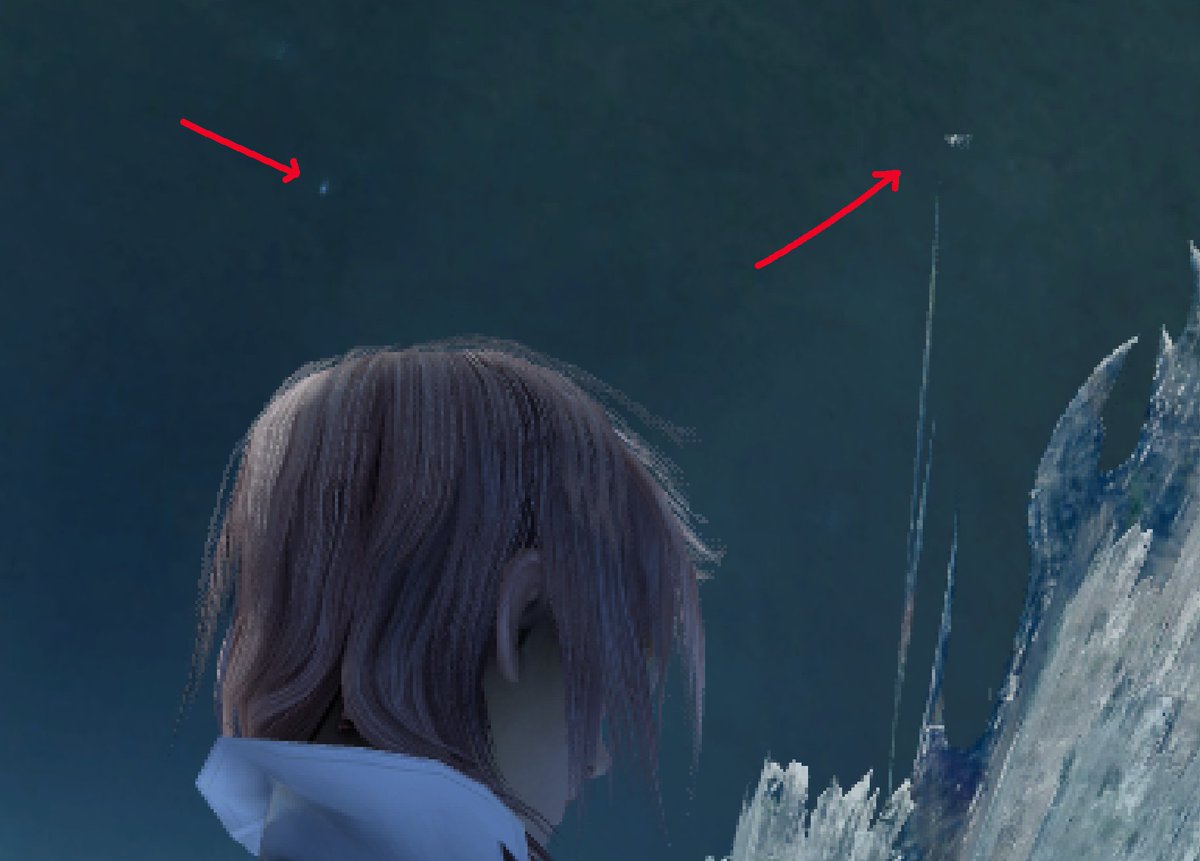
I can only assume this is a bug introduced in the PC port lmao
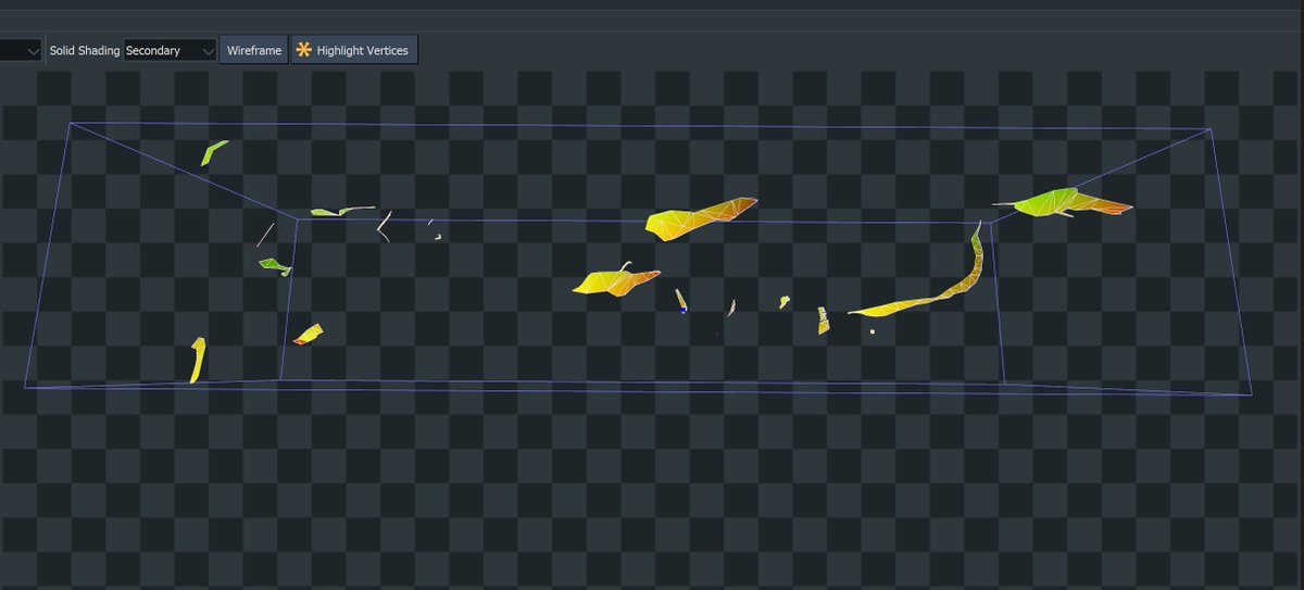
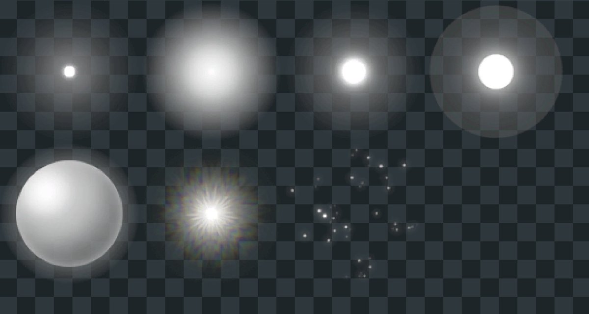
renderdoc says the *entire frame* is 354 draw calls, I can't imagine they actually shipped a console game with more than half the draw calls being individual 1px-high particles
Bloom implementation is completely standard. The thresholded image is copied into six successively lower-res buffers, each buffer is run through a ~5px two-pass blur, then all six levels are stacked up and blended back over the original image
nothing surprising here
actually I take that back: there is color grading, it's just very subtle and doesn't happen until later
It's a lot easier to see in motion, but I love how restrained it is. It's not NEXT-GEN HD GOD RAYS like.... basically every other game from 2009 lol, it just gives this really nice feeling of haze in the air
anyway yeah! That's the whole frame!
and like, not to make this A Dunk or anything; I liked ac2 and it had a lot of very impressive art and tech stuff going on
but NOTHING ELSE looked like this game at the time
tbh that's why I'm spending so much time digging into it
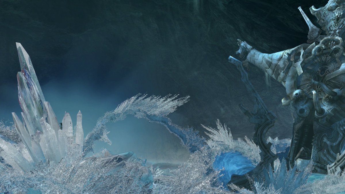
I have a distinct memory of playing this in college and getting to this crystal area and just being like "how the hell did they even DO this"
12 years later I'm like "huh I probably actually know how to answer that now"
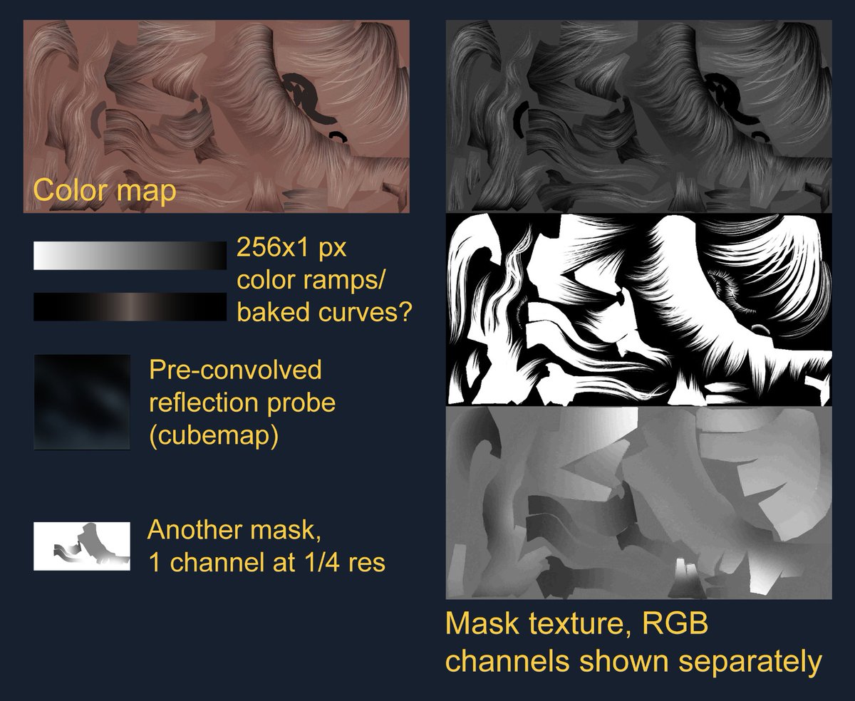
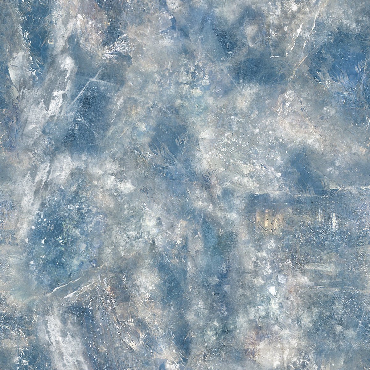
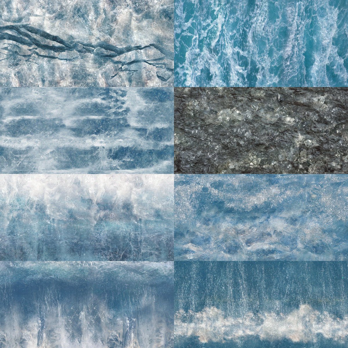
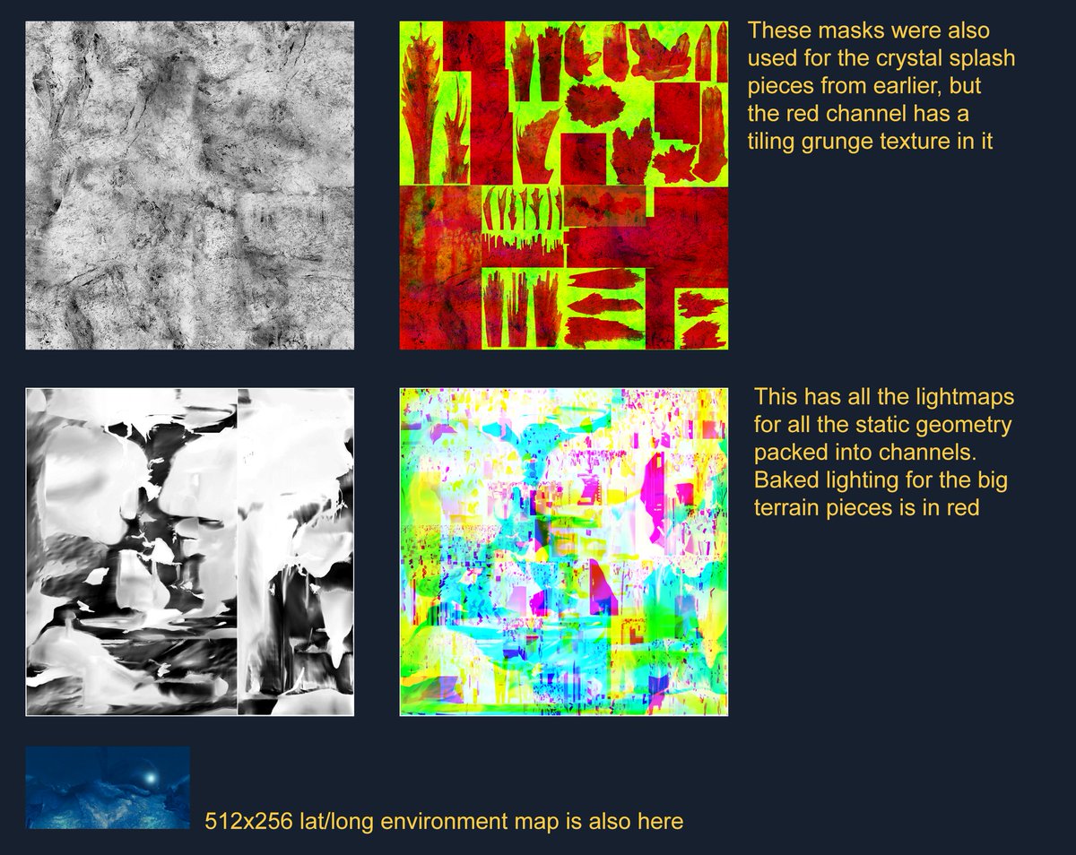
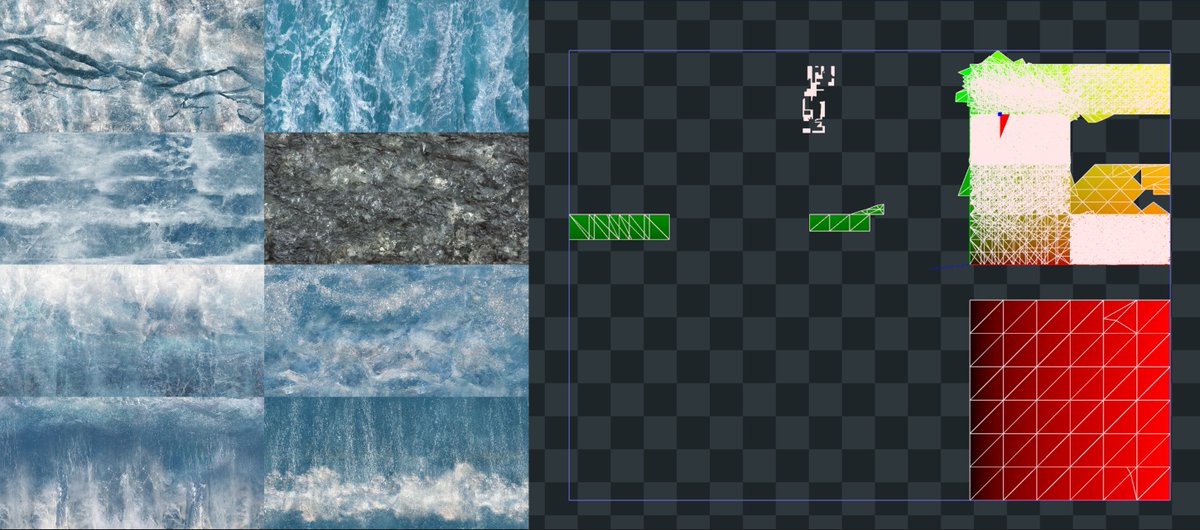
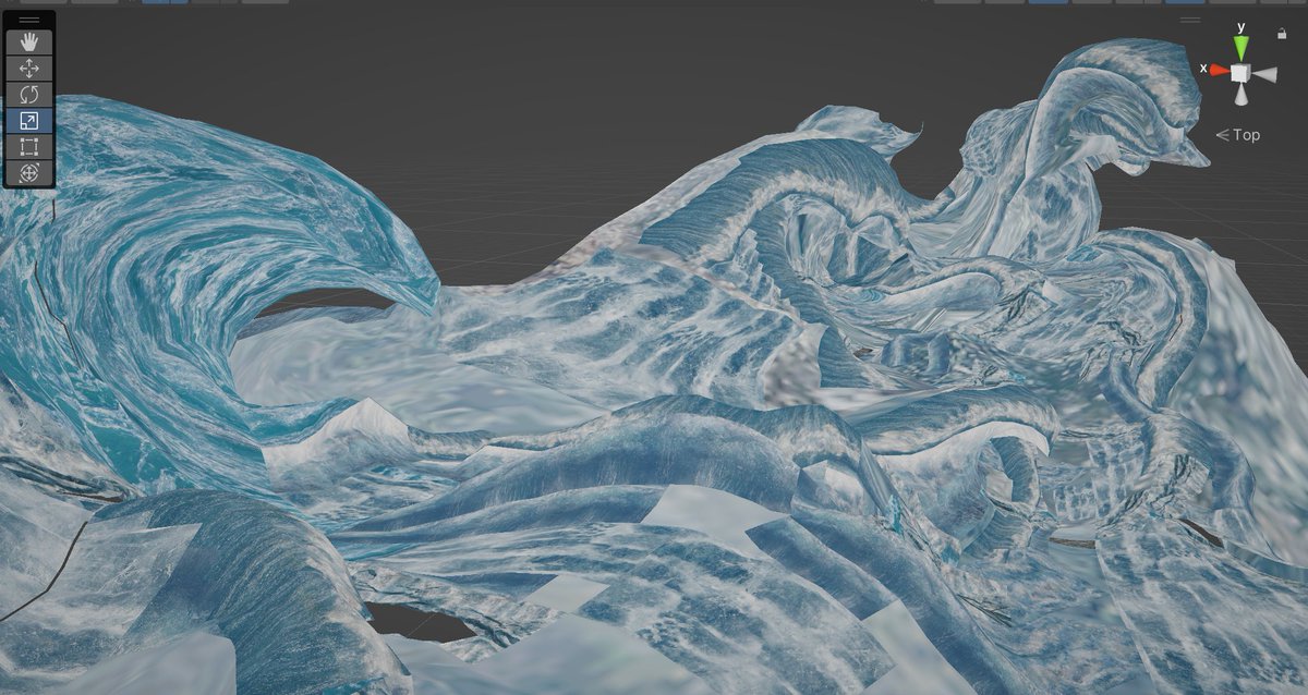
Surprising no one: turns out these are yet another "just a bunch of masks and multiple UV sets and a big pile of opaque tech-art" material
renderdoc can show us the ingredients, but not precisely how they're used
BUT
renderdoc can capture absolutely everything going IN to the shader
it can give me an image of what comes OUT of the shader
maybe I can just... figure out what it does by making my own shader from the same inputs
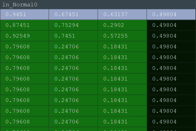
Side note: remember earlier I couldn't figure out why all the normals are in 0-1 range
turns out the blindingly obvious answer was just "they're R8G8B8_UNORMs lol"
surprisingly low precision but I can't argue with the visual quality
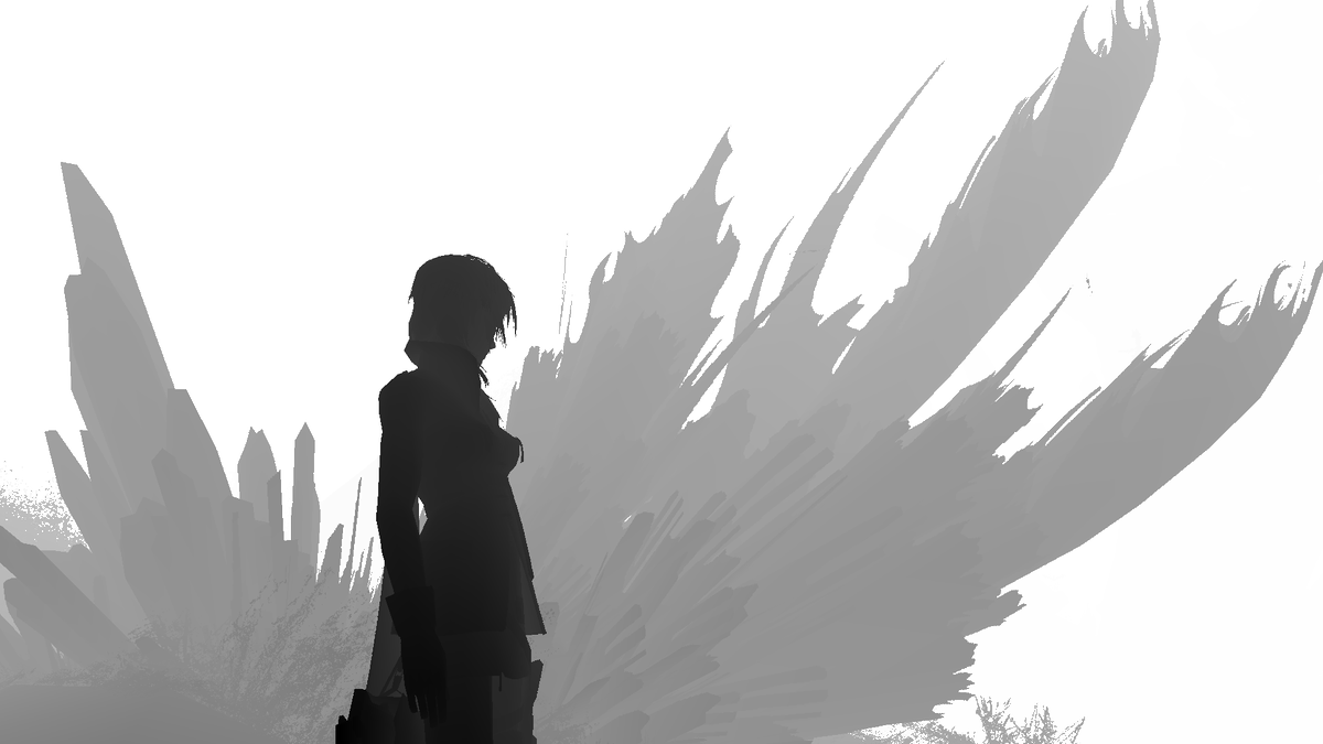
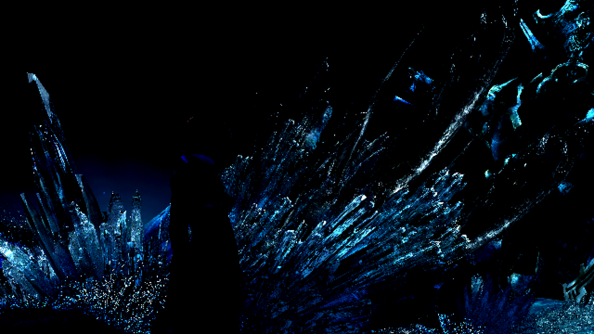
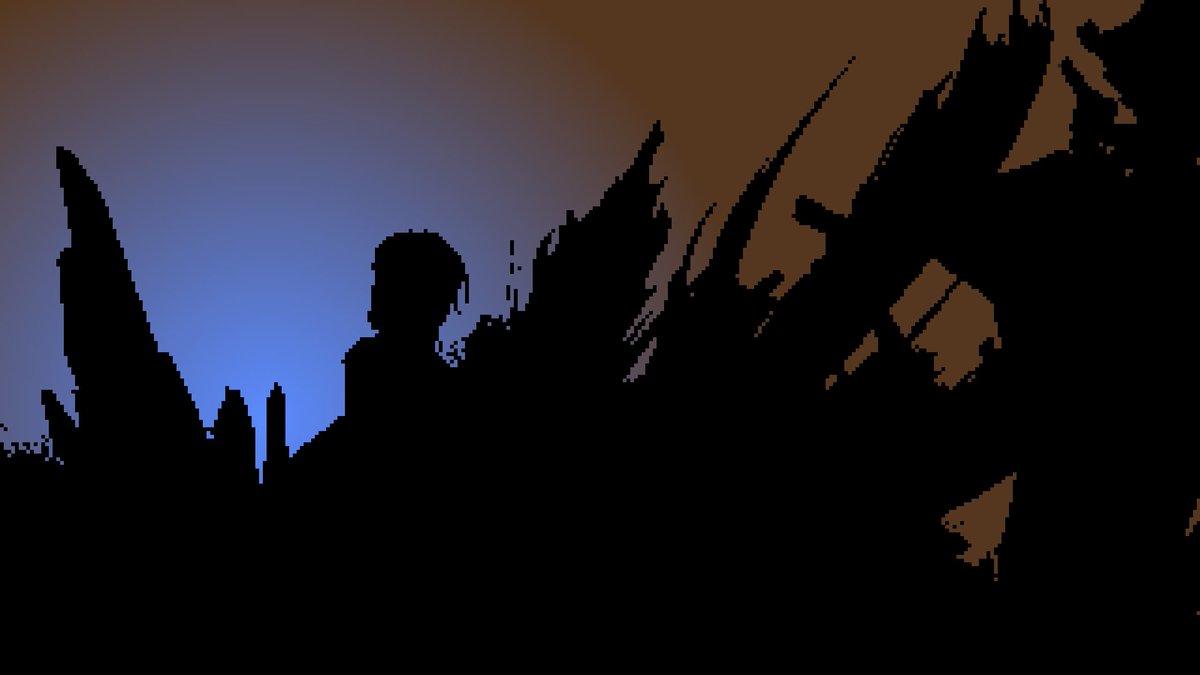
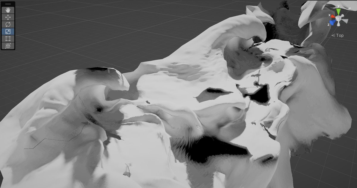
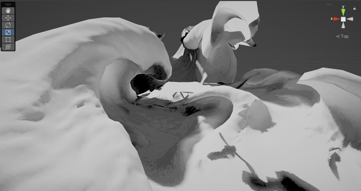
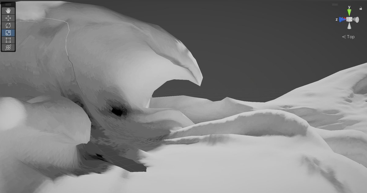
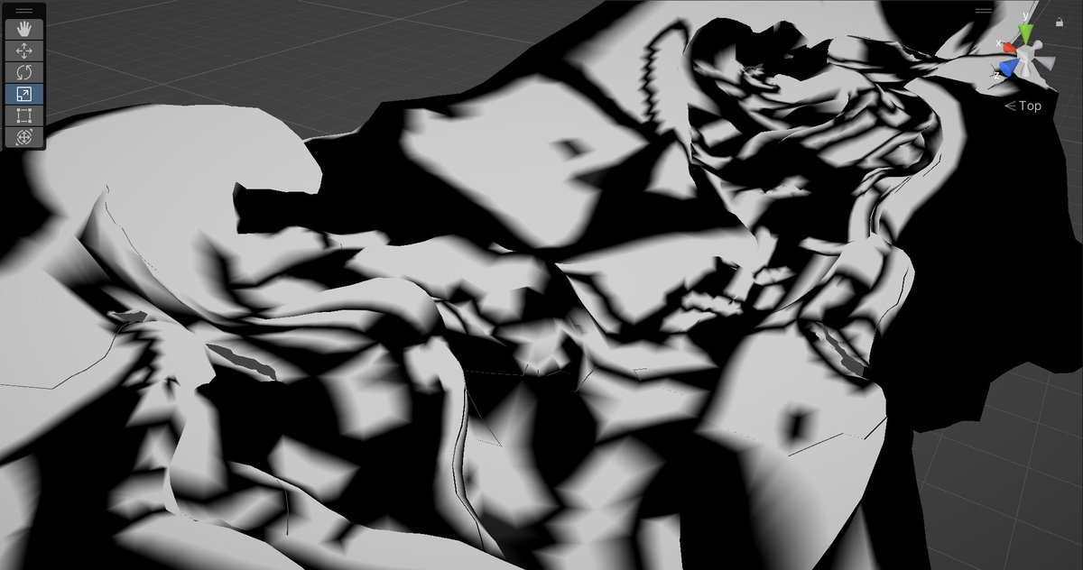
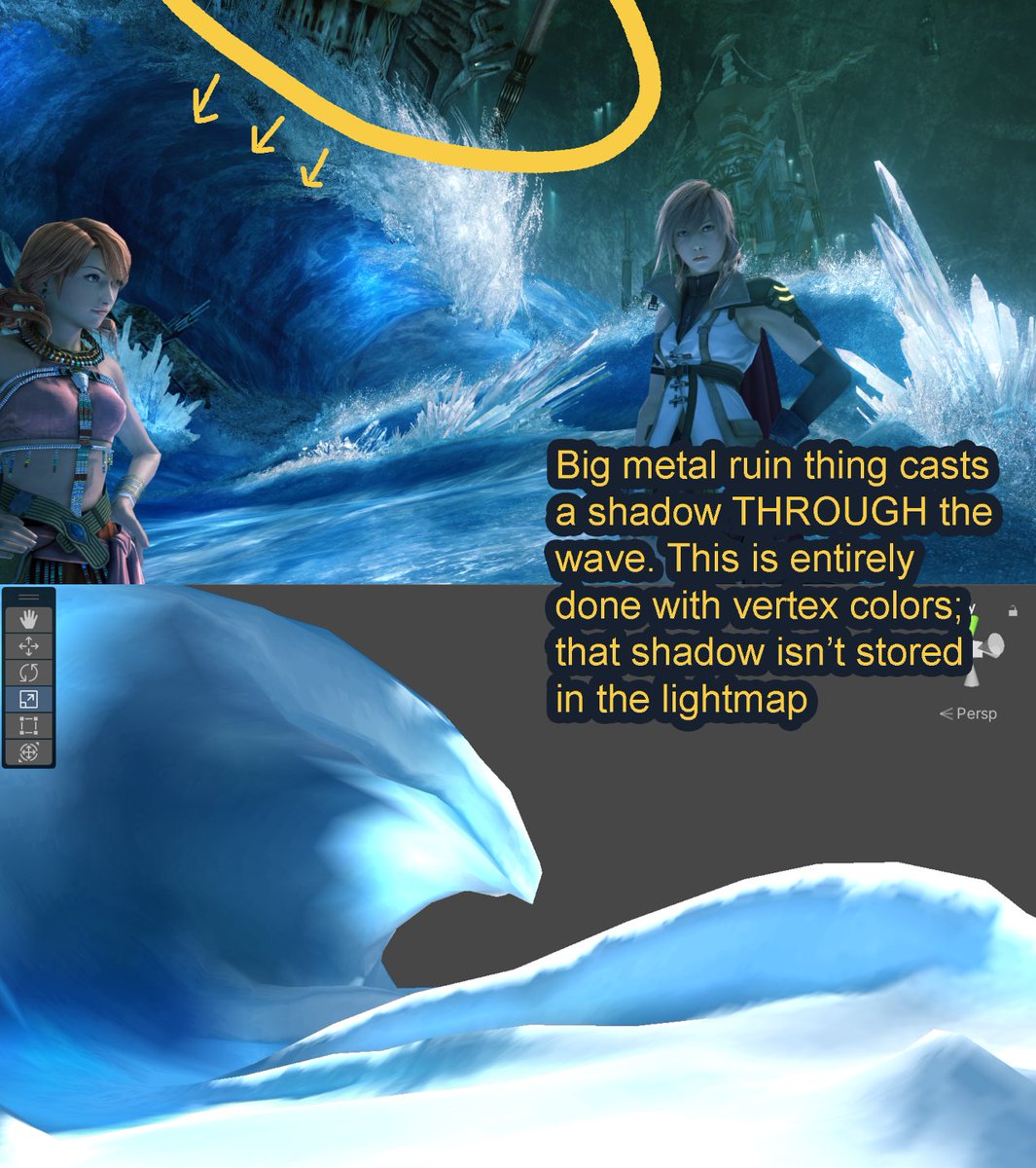
The solid black areas are underneath other static geometry, i.e. all the big metal ruins lying around the map
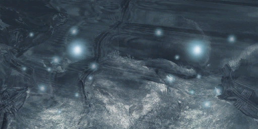
the bright values underneath the waves seem to just be exaggerated bounce lighting, although it's so strong it maybe kinda contributes to the "translucent crystal" look
so that answers this question from a week ago
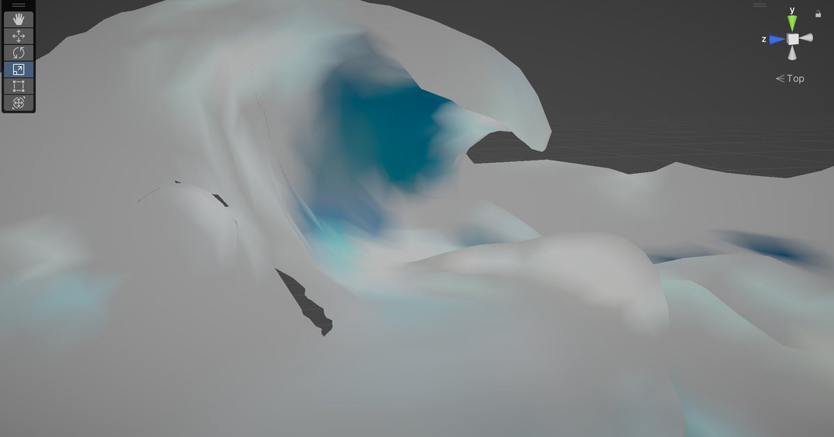
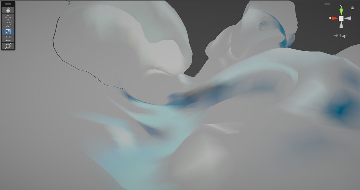
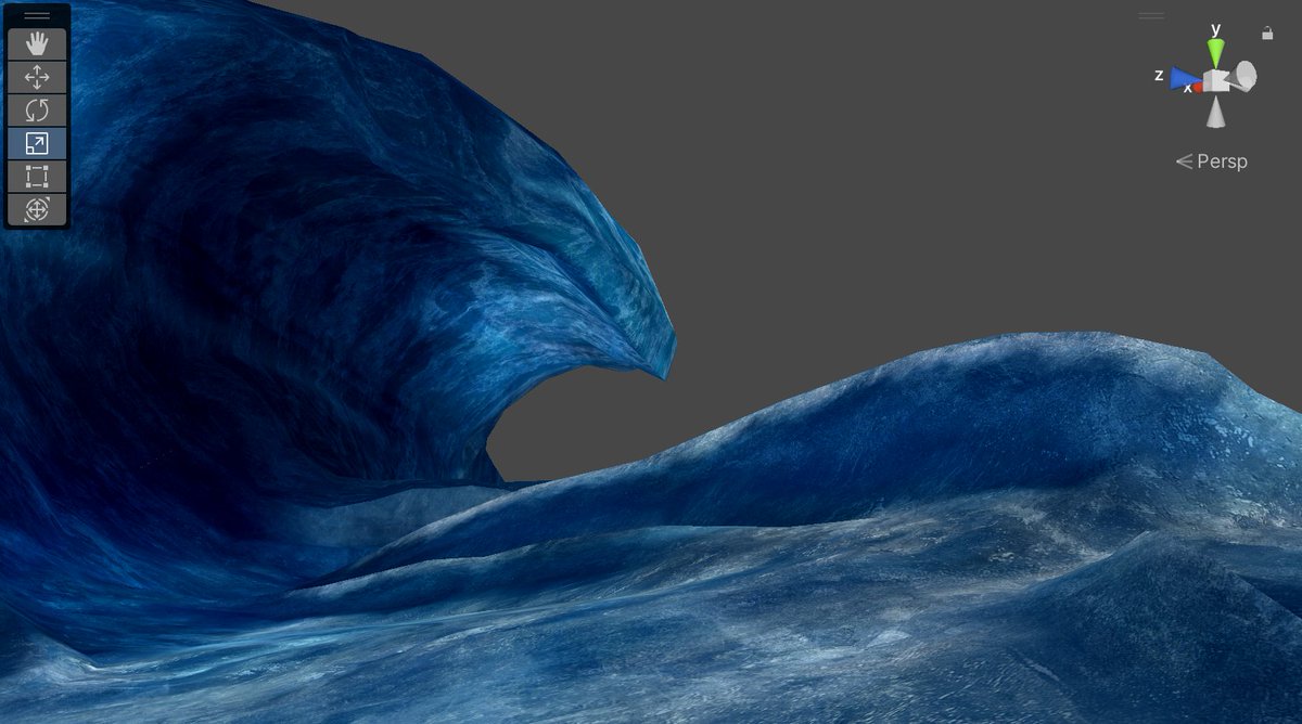
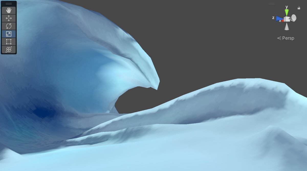
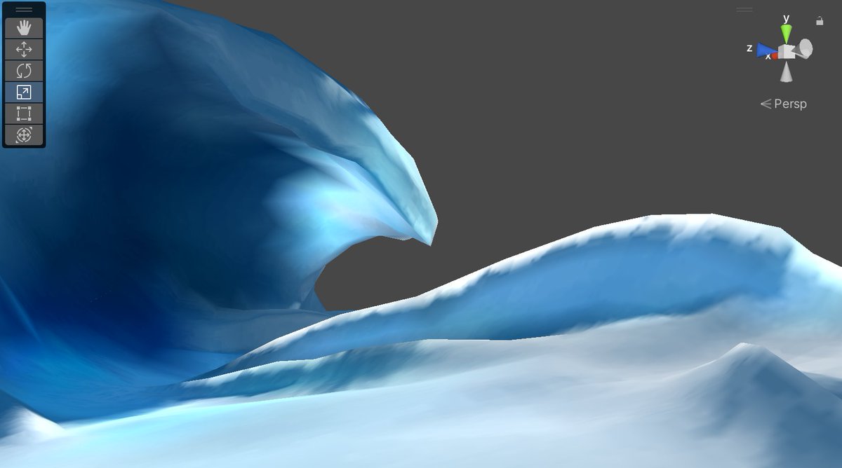
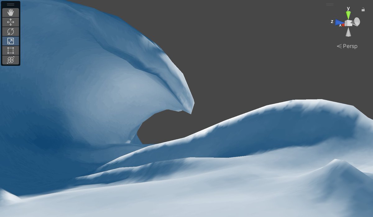
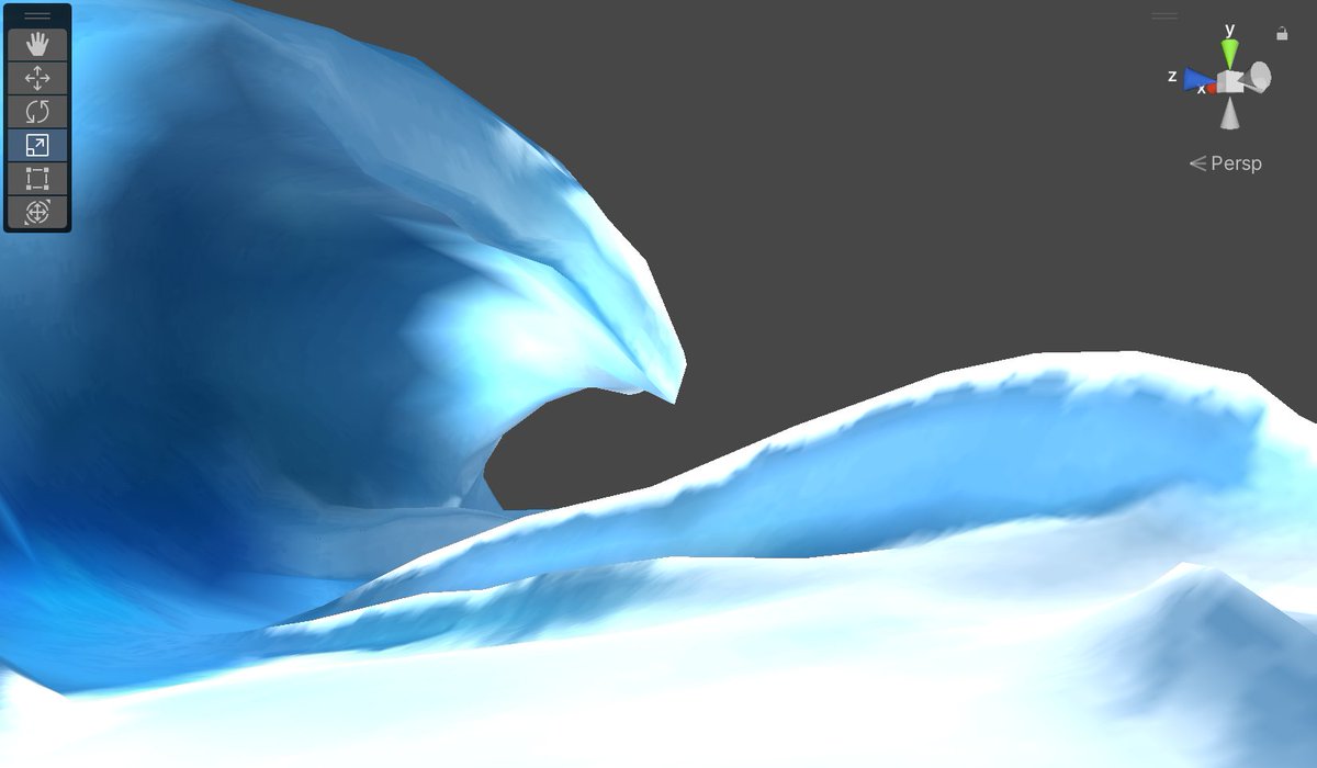
the waves do use baked lighting, but it's just a single-channel shadow term; no colored light filtering through glass. All the glowy translucent colors are from vertex painting and careful texture placement
there are infinite ways you could go about this. I'm basically gradient-mapping between two colors but there are lots of other options the game artists could have used
they're definitely punching up the contrast though; this is all vfx-y pow/bias/smoothstep range-remapping stuff
I had a mostly-working prototype and a bunch more screenshots to get through but then I went to bed and realized I was probably way overthinking a few parts so uhhhhhhhhh brb i guess
Okay so I don't have answers yet but
remember earlier I was like "figuring out how the lighting works is probably too hard" well ehhh what if I tried anyway
The only input data that's relevant to lighting is a 1-channel baked lightmap and some vertex colors
(okay and also giant cbuffer of 255 float4s containing almost every shader uniform for every draw call in a big pile but hopefully that isn't important 🙃 )
started wondering if I can screw with renderdoc to visualize JUST the lighting component
I know the decompiled shader code looks like some Cyber Hacker Shit but it's at least sorta reasonably straightforward to find where the textures are being sampled
I'll keep poking at this for a bit but I doubt I'll fully replicate the real lighting
This is interesting though! It means that, in addition to all the extremely skilled modeling/texture work, at a pure technology level this game DOES use a pretty sophisticated lighting model
fused-multiply-add like what if lerp was a giant pain in the ass to read
you cant do two maths at the same time thats cheating
Gotta finish explaining the textures first though
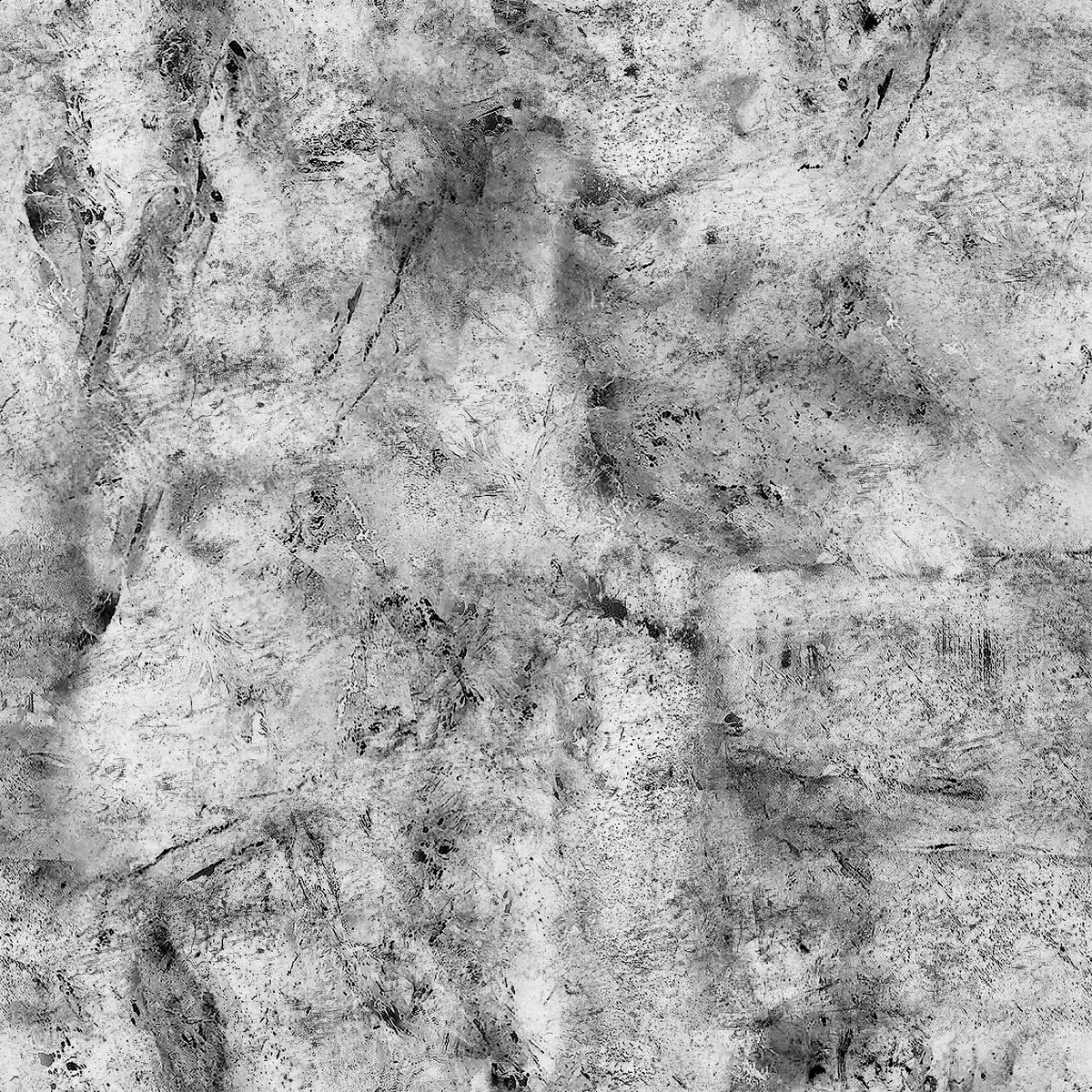
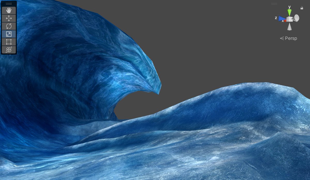
Previously On This Thread: there's two main color textures with separate UV sets, one big tiling map and a bunch of (essentially) decals. A mask stored in vertex colors is used to blend between them
Interestingly, a lot of the darker blue colors aren't actually coming from the lighting OR the base textures, but are actually just because the environment map is blue
rather than accurately mirroring the scene like a probe would, it's a unique piece of this one material's look
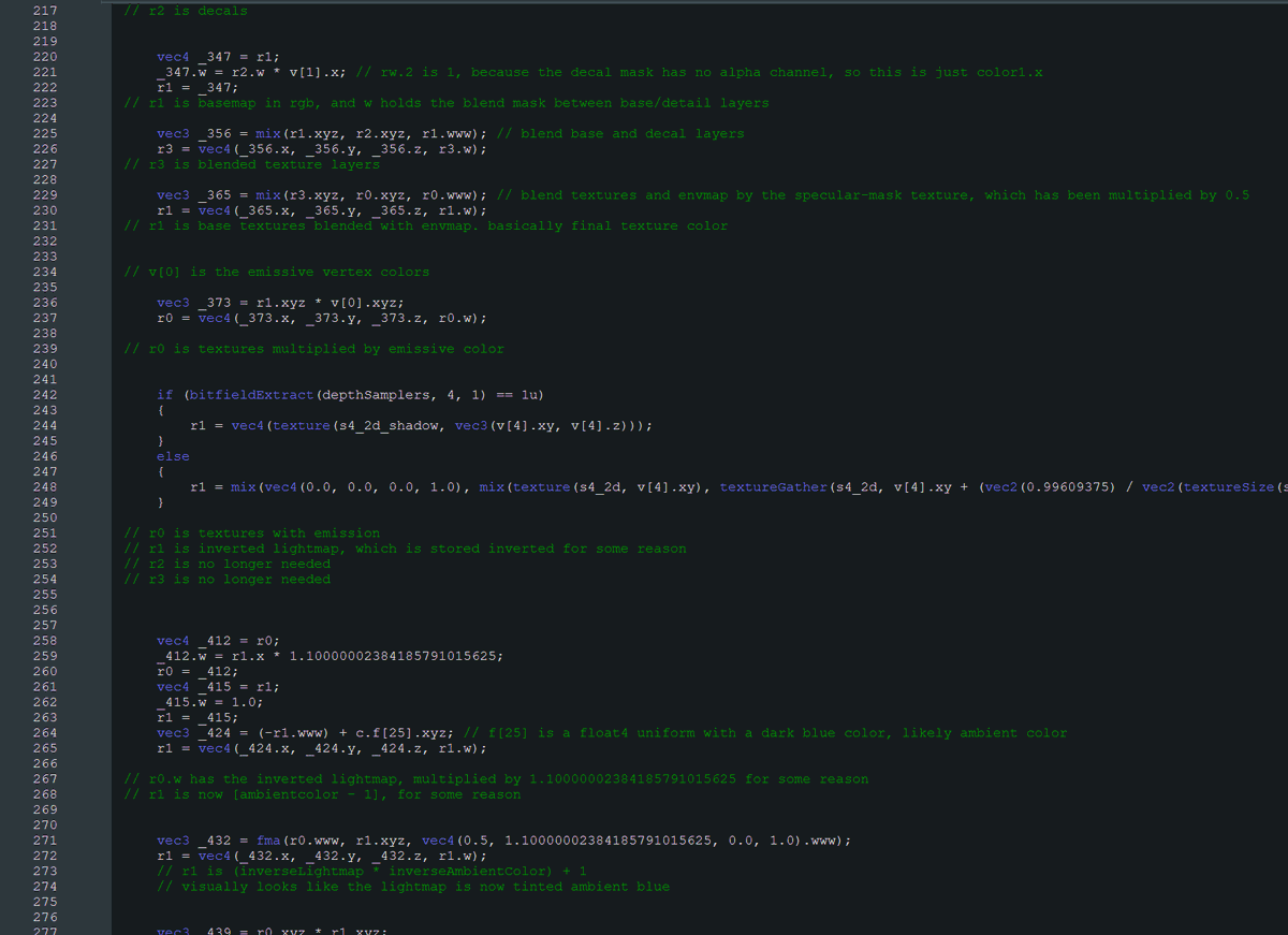
anyway long story short this is where I went insane and started reading the shader decompilation
an activity known as Spurve Scrying
if john khronosgroup didn't want me calling it spurve then he shouldn't have named it spurve
To recap, the inputs here are:
- Single-channel lightmap, stored inverted (shadow is 1, light is 0)
- Emissive-like RGB values stored in vertex colors
- Giant uniform cbuffer with 255 unnamed float4s lol
So my first guess for the lighting model was old-school ambient+direct, right
turns out it's even simpler, it's just a shadow color, and an implied light color of 1
so instead of ambient+direct*lightmap, it's just lerp(shadowcolor, white, lightmap)
it's Weird about it though
Remember the lightmap is stored inverted? I think this was done so that the shadow intensity could be adjusted with a single multiply
since 1 in the lightmap means shadow, that 1.1 scalar pushes all the values darker, overshooting the lerp and boosting shadow intensity
here's what dragging that "shadow intensity" constant between 0 and 2 looks like
The vertex colors, at least, are straightforward
Like I said earlier, they're roughly centered around 1, so by multiplying them with the rest of the lighting they can both increase or decrease the lighting intensity
okay next up: FOG
jk im skipping fog
it's just fog who cares. the other light-blue color in the uniform array was the fog color. alpha controls the falloff distance
I guess it's worth noting the fog strength appears (appears) to be derived from the vertex Z position in NDC space
meaning the fog changes if you change the camera's near/far clip planes
that was probably annoying to work with
Oh yeah also notable:
No part of the lighting relies on normals. No N Dot L or fresnel term or anything; all the lighting is completely static
The vertex normals are only required in order to sample the environment map
Behold!
This is incredibly cool, because like, this is all before postprocessing right. It's like... preprocessing. Directly manipulating the material colors after textures and lighting have been applied
Why have global tonemapping when you can just have per-material tonemapping
I skipped over it but there's another uniform that's multiplied with the result, seemingly as an optional color tint. It's unused here (values all 1), but the color was presumably exposed to the artists
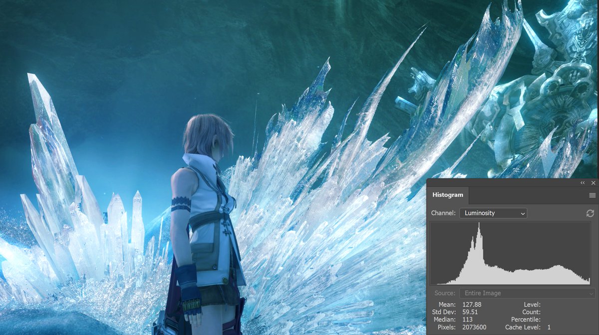
This feels tightly connected to the histogram stuff I talked about earlier. There are SO MANY tools here to let the artists tweak colors and intensities in order to dial in a perfect exposure
Beyond just authoring textures, they can change the color and intensity of the baked shadows, paint light/shadow and hue shifts into the lighting via vertex colors, tint the result AFTER lighting, and finally tweak brightness/contrast of the end result
Obviously none of this is terribly surprising if you're used to pre-PBR workflows, but we've been in PBR Land for like a decade+
I am Not Young and my whole career has been metallic-rough maps and BRDFs
really fun to dig into this and see so much control exposed to the artists
PBR's Whole Deal is simulating light and then using global postprocessing to control how that light interacts with a camera
but sometimes a camera isn't the right metaphor dude. sometimes you just want to let artists pick colors that look good
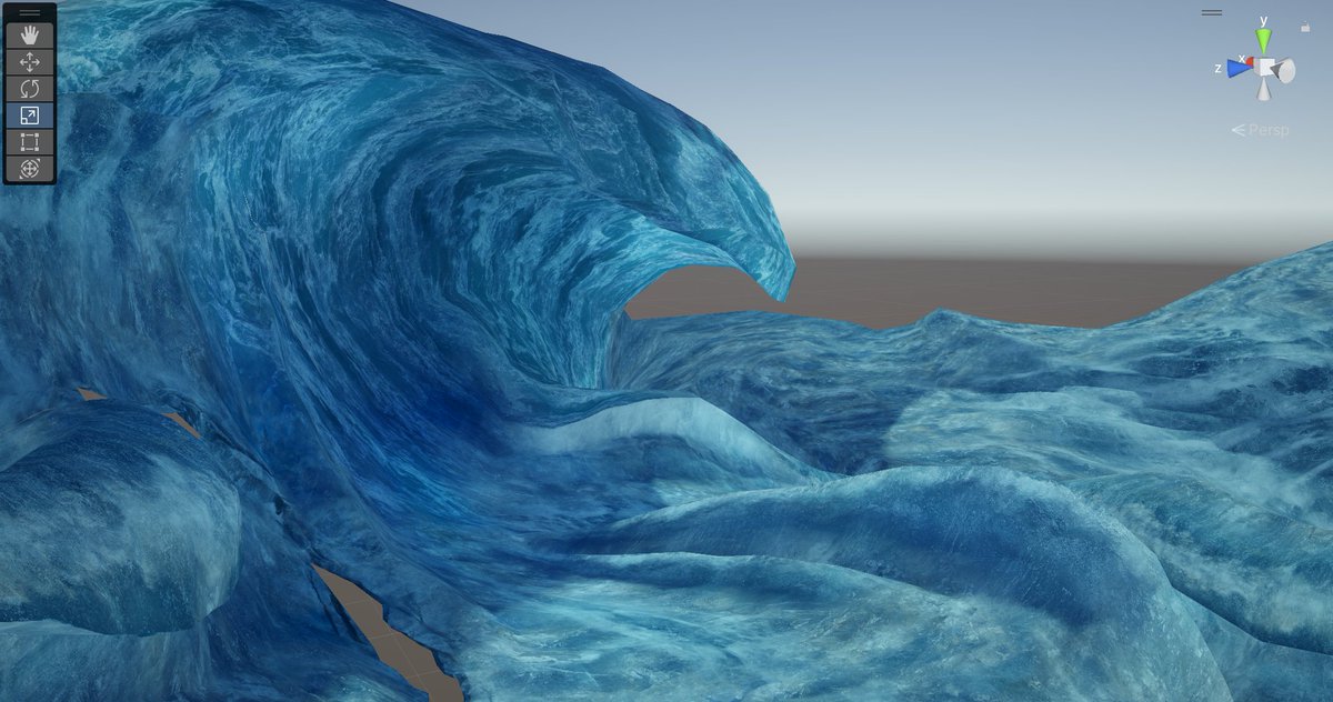
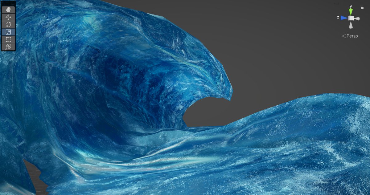
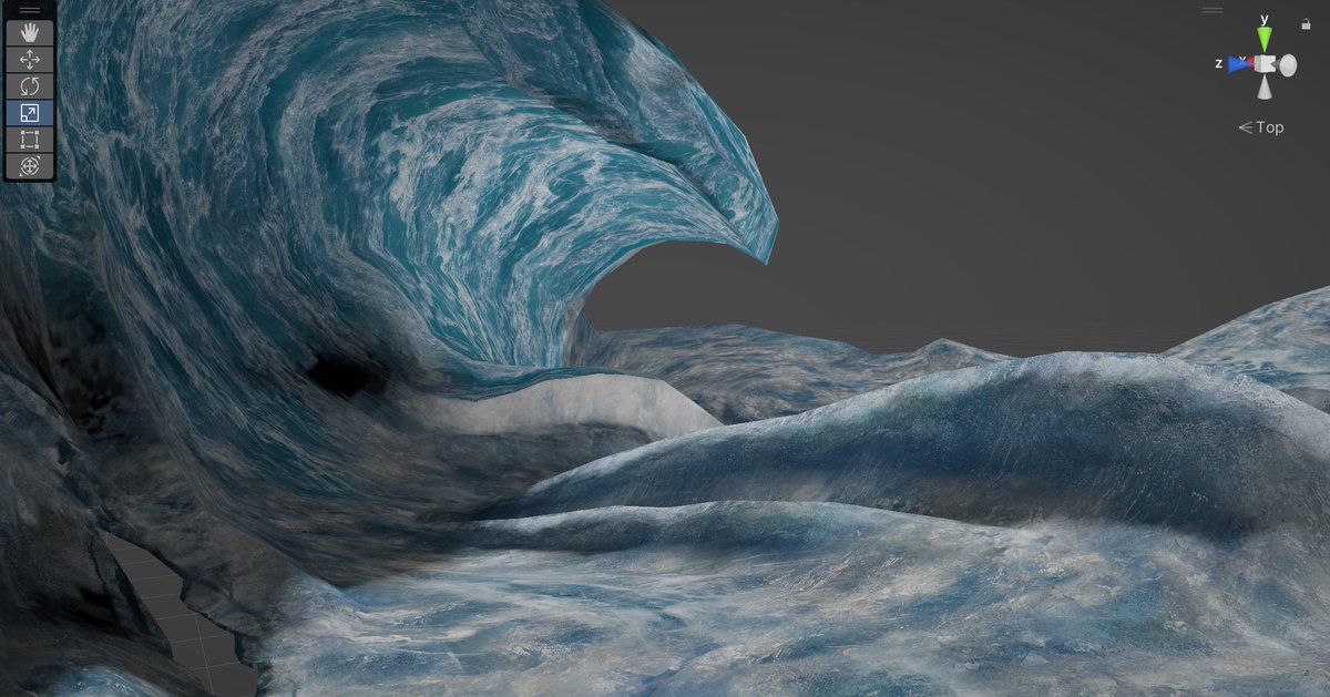
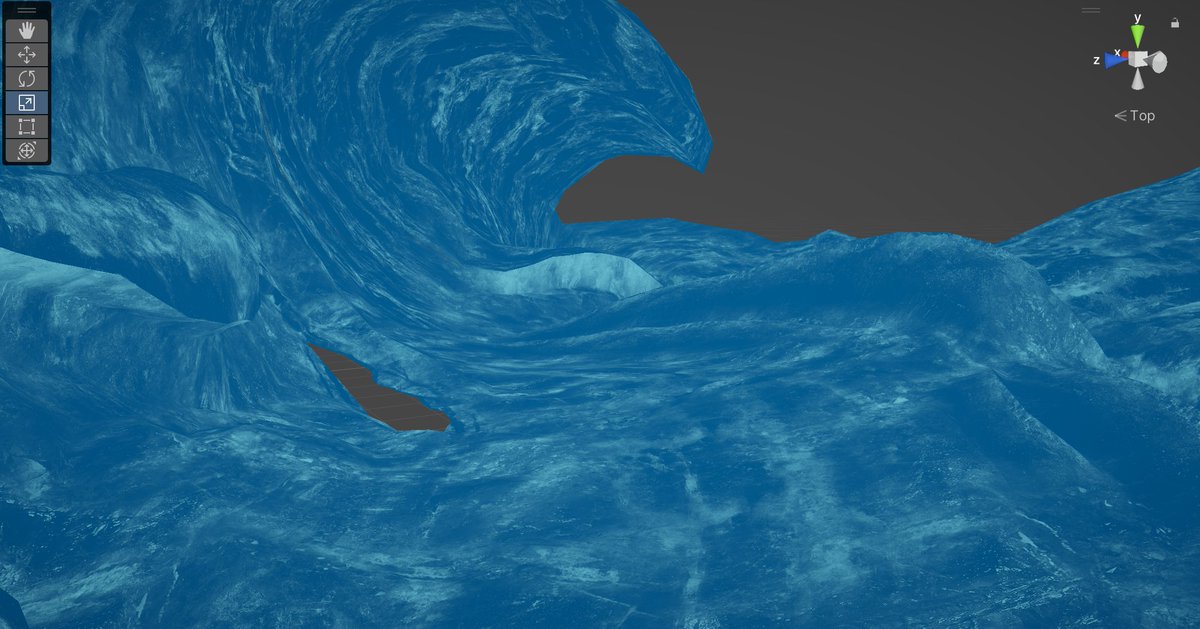
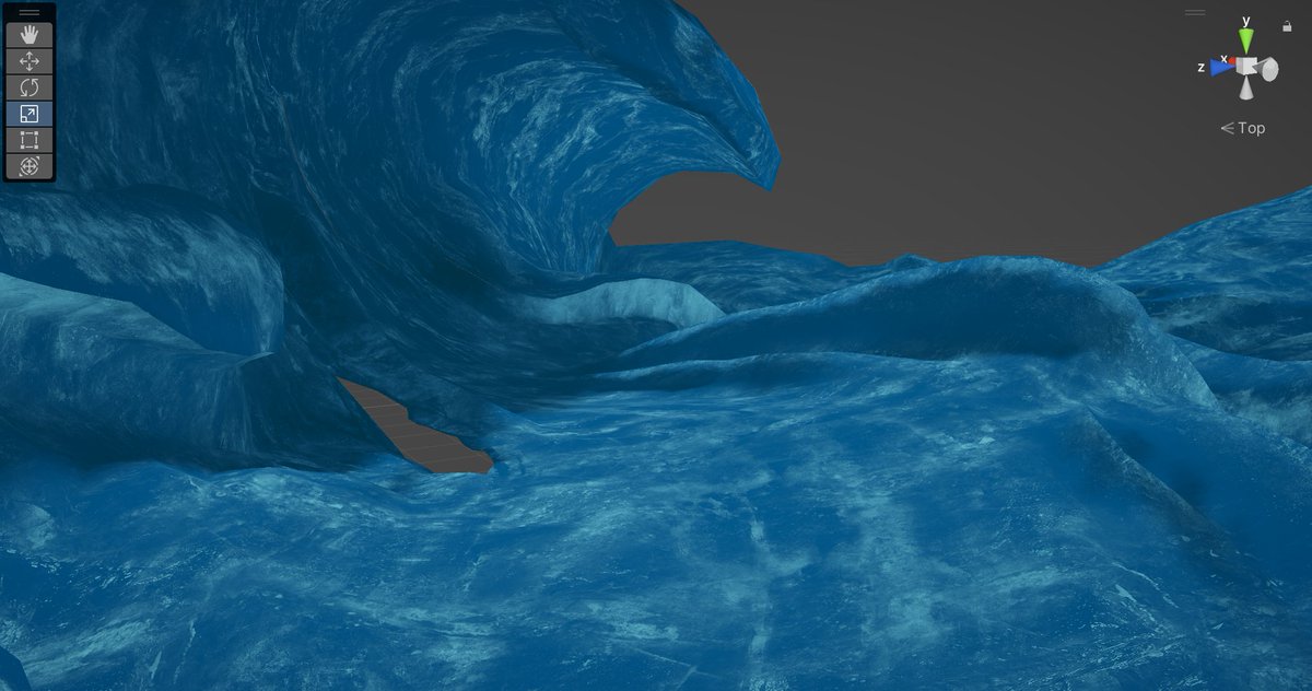
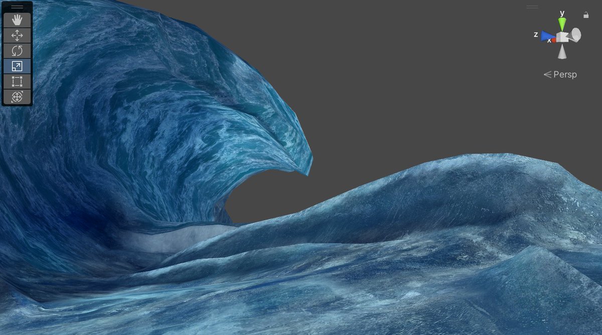
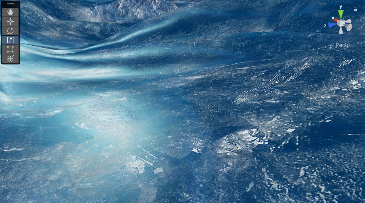
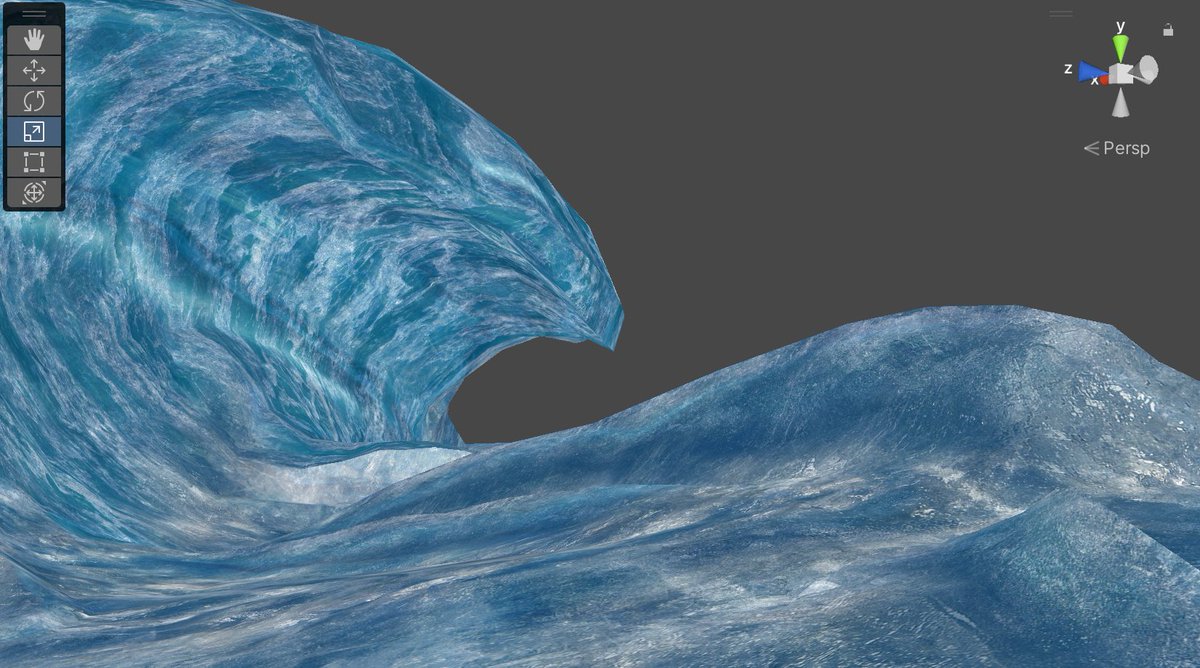
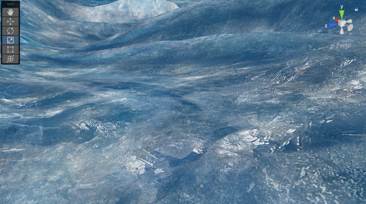
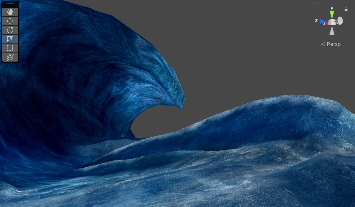
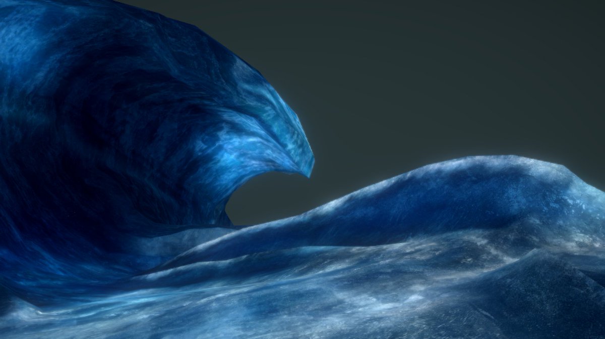
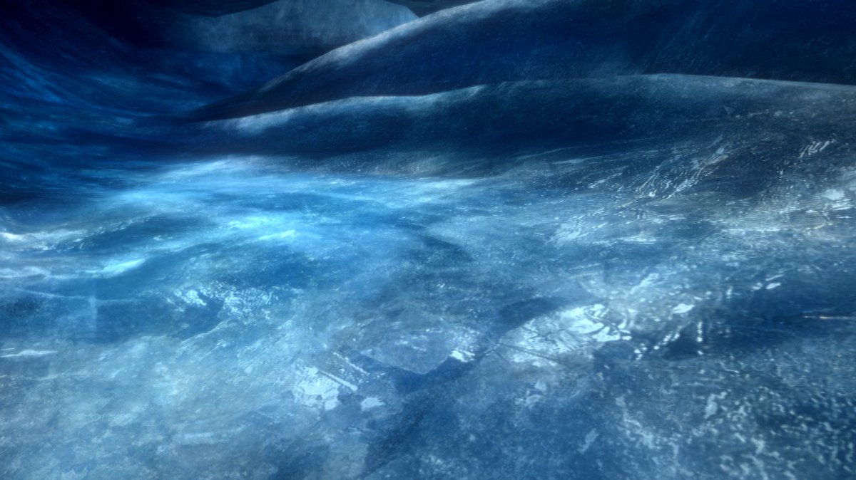
In fairness this isn't really unity's fault
The game is using LDR bloom where you threshold the image and remap the result so it's extra intense
Unity's trying to bloom overexposed HDR values, which would normally be oversaturated to begin with. Without that it gets washed out
Anyway! I am Done!
I have answered all of my questions about Final Fantasy XIII's crystal rendering technology
god that took... most of my free time for a week and a half. or i guess twelve years depending on how you count
I'm going to play Final Fantasy XIII (2009) now
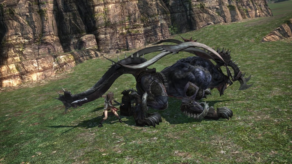
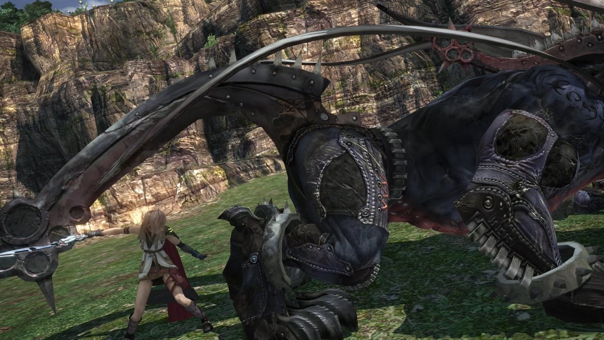
lightning finalfantasy obliterating a cop with the most complicated punch ever conceived
she is punching this man for like four entire seconds
STEALTH
an important thing you should know about Final Fantasy XIII is that Troy Baker rides a motorcycle made out of women
also the motorcycle fight is mechanically incomprehensible and comes totally out of nowhere and has no thematic connection to the rest of the game
all the other summons are like manifestations of the characters' self doubt but the first one is just "what if motorcycle horny"
lmao lightning rules. eight hours into the game and she goes "fuck this I'm killing god" and leaves the party
there's a whole cutscene where she brings it up and everyone else is like "wait how would even help" and her answer is just I DON'T TAKE ORDERS FROM GODS
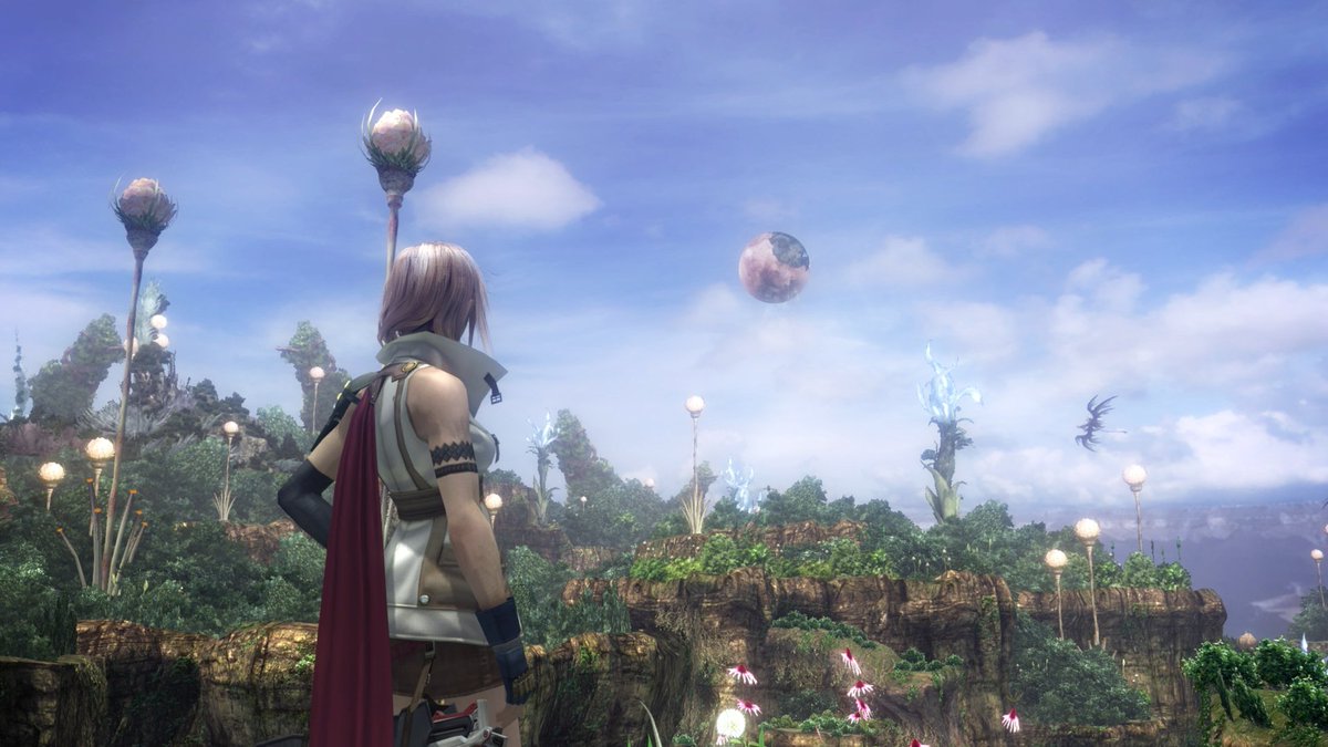
extremely cool: the horizon is like slightly weirdly too high up, because of the whole "we live in a giant orb so the ocean is curved" thing
I don't think I even noticed this the first time I played it; the game calls so little attention to its own setting
come to think of it, I don't think ANYTHING in the early cutscenes or dialog even mention the orb thing
there's an explanation in the codex if you go looking for it, but the writers really don't seem concerned with making sure you get it
as a visual/thematic metaphor it's as just ridiculously unsubtle as the Midgar plate (it's literally named Cocoon lmao), but in FF7 every person you meet complains about the rich guys that paved over the sky and then you get the train map that's a 3D model of the whole city
but here's it's just never really mentioned
you'd think they'd treat it as a Big Reveal when you eventually break OUT of the cocoon, but IIRC it just assumes you read the wiki in the menu so even then it's just kind of "oh hey there's the orb. neat"
I don't think this was unintentional either?
like they just committed REALLY hard to an in-medias-res concept, do a degree that really alienated a ton of players. but it's still like.... I can respect the audacity of just Going For It that confidently
I'm not even making a joke really; it's pretty much the actual text
remember when gamers were like "lightning sucks she's just cloud but a girl" and im like YOU THINK THAT'S A *BAD* THING???
Like ten hours in we finally get the first clear shot of a distant landscape and the upward-curving horizon
even then there's so much haze and clouds and sick-ass molten crystal sundogs (??) that it's still, like, pretty easy to miss the fact that there's land in the sky
this was the last good phone ever designed
steve jobs ruined everything and then sora and the FFXV bros just got regular-ass touchscreen slabs
even the splatoon kids aren't allowed anything cooler than iphone but triangle
(I would also accept any of the phone designs from macross frontier)
I really like this city environment. Neat sense of scale with like multiple layers of bigger and bigger buildings in the distance
Also really cool use of materials. Wood and stone and glass and tile all look distinct, despite just having envmaps and static lighting to work with
you eventually work your way through the city and end up on the rooftops and it does The Dark Souls Thing where you can see a bunch of places you passed through earlier
as much as I like this game and am loathe to acknowledge the opinions of Gamers, I must concede that, yeah, the whole hope/snow story arc is extremely boring and irritating
it's thematically interesting, but I think the problem is we're never given any reason to LIKE either of these guys before their Flaw Arc starts
so instead of "compelling characters in conflict" it's just "15 hours of two insufferable shitheads who suck ass"
this is worsened by the fact that, for a big chunk of it, these two guys are the only people in your combat party and their jobs are essentially Bard and Tank
so it's two insufferable assholes who suck and also CANNOT INFLICT DAMAGE so every fight takes 6x longer than normal lol
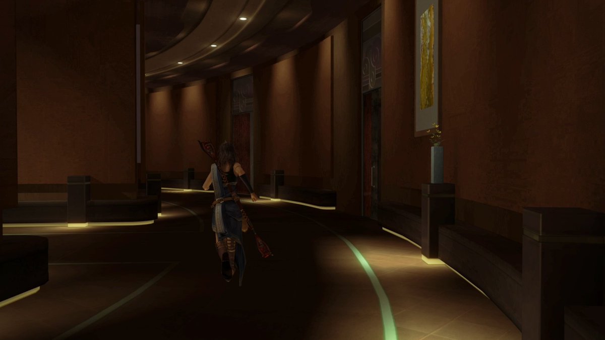
always love a good unnervingly cavernous jrpg hallway (this is inside an *apartment*)
maybe the wildest thing about replaying this game is that in 2010 I was still a whole-ass Presbyterian and was like vaguely uncomfortable with the Overt Lesbianism and now 12 years later im like HELL YEAH STOP PUTTING STRAIGHT PPL IN VIDEOGAMES
character development arc i guess
motomu toriyama defeating calvinism with the power of gay anime
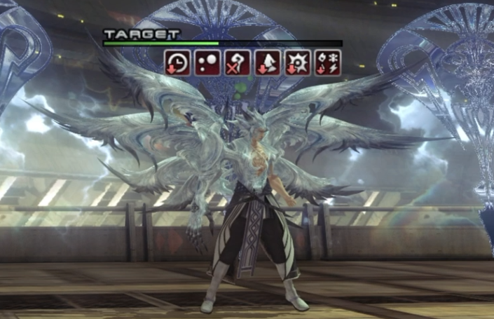
"what if we made an rpg where buff/debuff classes were actually really good and important"
it rules
this game's combat system is incredibly cool; I genuinely don't understand why all the redditgamers convinced themselves to dislike it
"all you do is hit Auto and the game plays itself" no it doesn't??? The whole thing is designed around proactively switching classes; you're supposed to micromanage roles, not individual attacks
you assign jobs to everyone and then the "auto" button is actually just "execute"
you have to constantly keep buffs and debuffs and stagger damage and "sustain stagger" damage all maintained simultaneously
if you're doing it right you're swapping classes every 1-2 turns. If you're NOT doing that you will get straight up killed by basic-ass popcorn enemies
it's super fun!
It's not wildly difficult but it's FAST and you're constantly Doing stuff. If you're on top of things you can keep enemies locked down for the whole fight and win quickly, but if you ever stop paying attention even totally basic encounters can kill you in seconds
honestly gamers do this thing where if enough of them decide a game is Bad then that becomes the official party line and then a bunch of them invent a litany of totally bizarre criticisms to justify that decision post-facto
like I distinctly remember a redditor complaining about vanille's "fake australian accent" (vanille's voice actress is Literally From Australia but apparently the fact that she doesn't sound like the crocodile hunter means the game is bad)
anyway I suspect this is what happened re: /r/gamers and the combat system lol
like the game definitely has its share of Problems that you could get mad about but the combat system really isn't one of them
(Also you can just not like things! You can even dislike things you think are Good! You're allowed to have tastes! You aren't *required* to invent a reason why a work is Objectively Deficient if the vibes just don't really click with you! god)
anyway ill stop getting mad at redditors from 2010 now
oh yeah forgot to post this one earlier
turns out there's actually Lore for vanille's weirdass antler-whip-yoyo-staff weapon
apparently it's a lasso for catching robotdragons so her Dragoon GF can fly them. like the worm hooks from dune but like more gay
this is uhhhh way too hard to explain but there's an orb named Karl in XIII-2. like it's just an orb you can talk to and it's like "hi im Karl"
I think I may have stumbled into a side quest about Orb Lore
*pat*
hall of fame elevator design. myst III exile ass elevator design
this is possibly the most incomprehensible cutscene square has ever made
why is there an f-zero race
where is literally any of this occurring
why is the camera moving like that
what the Fuck is even happening
it's like Michael Bay's Haloid or something what the actual hell lmao
I had to trim the beginning to fit under twitter's length constraint but rest assured: there is no context. the first several minutes are just space racecars lining up like the beginning of the phantom menace podrace, absolutely out of nowhere
incredible work
lots of extremely cool megastructure stuff towards the end of the game
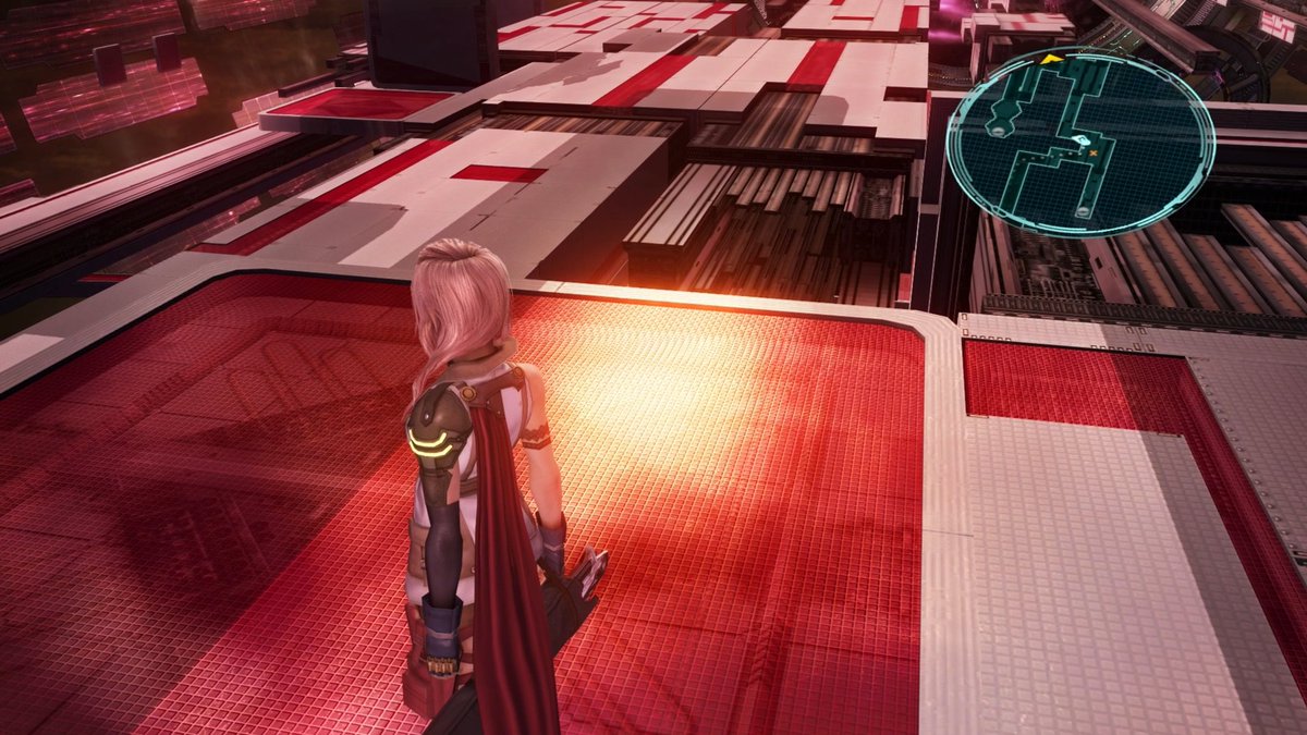
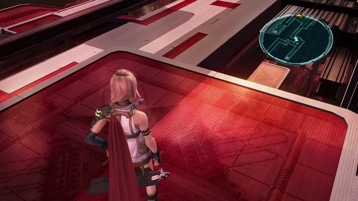
I really like how their chosen aesthetic for sci-fi architecture is like a cross between a luxury handbag outlet store and the trackmania nations forever stadium
also I didn't mention this when I was digging through renderdoc, but the game uses a 40 degree FOV lmao
it's part of why the game looks so good (long lenses make everything look better, it's a deliberate aesthetic choice despite what Some You Tube Ass Holes told the gamers), but it does make taking nice screenshots of the environments very difficult lol
Instead of finishing final fantasy xiii I have ended up doing a bunch of the endgame quest stuff and it's..... not very good lol
I remember ppl arguing with the Ornate Hallway Haters by being like "it opens up later!" but it opens up into something less fun than ornate hallways
there's a big huge map but the only thing you do is talk to statues that tell you to go kill a monster on the other side of the map. You (mostly) can't fast travel, and the quests are all numbered so it immediately tells you you'll be doing this like 70 times lmao
maybe worth it for this cutscene though
there are a handful of super special unique bosses, and then when you challenge one of the later ones this happens
the death animation with the crystal flying out is normally what plays when you defeat one of the special bosses. it's also a totally unique enemy design that has not appeared in any previous fight
they fully modeled/animated a new boss for this one-off fakeout gag lol
extremely cool-looking final dungeon
also after like 55 hours the minimap being an oval is STILL messing with my head
it looks exactly like it was supposed to be a circle in 4:3 and then widescreen stretched out the UI (like basically ever PS2 game including FFXII)
but no they just made it like that, on purpose
Really cool texture work on on these floor panels
recall from earlier that static meshes have no normal maps or realtime lighting, so this is all textures/masks
looks like the envmap reflections are modulated by the little tile pattern, so it appears bumpy even without normals
oh wow this is rad
again, no realtime lighting on static geo, so all specularity comes from envmaps
Check out how the reflections on the floor are blocked by shadows
I think they're using the baked shadow map to mask out the envmap term, in order to fake specular occlusion?
I haven't seen them use this anywhere else, although maybe I just wasn't looking close enough
the trick only works under fairly limited lighting+view directions, but since it's a really constrained boss arena it works perfectly
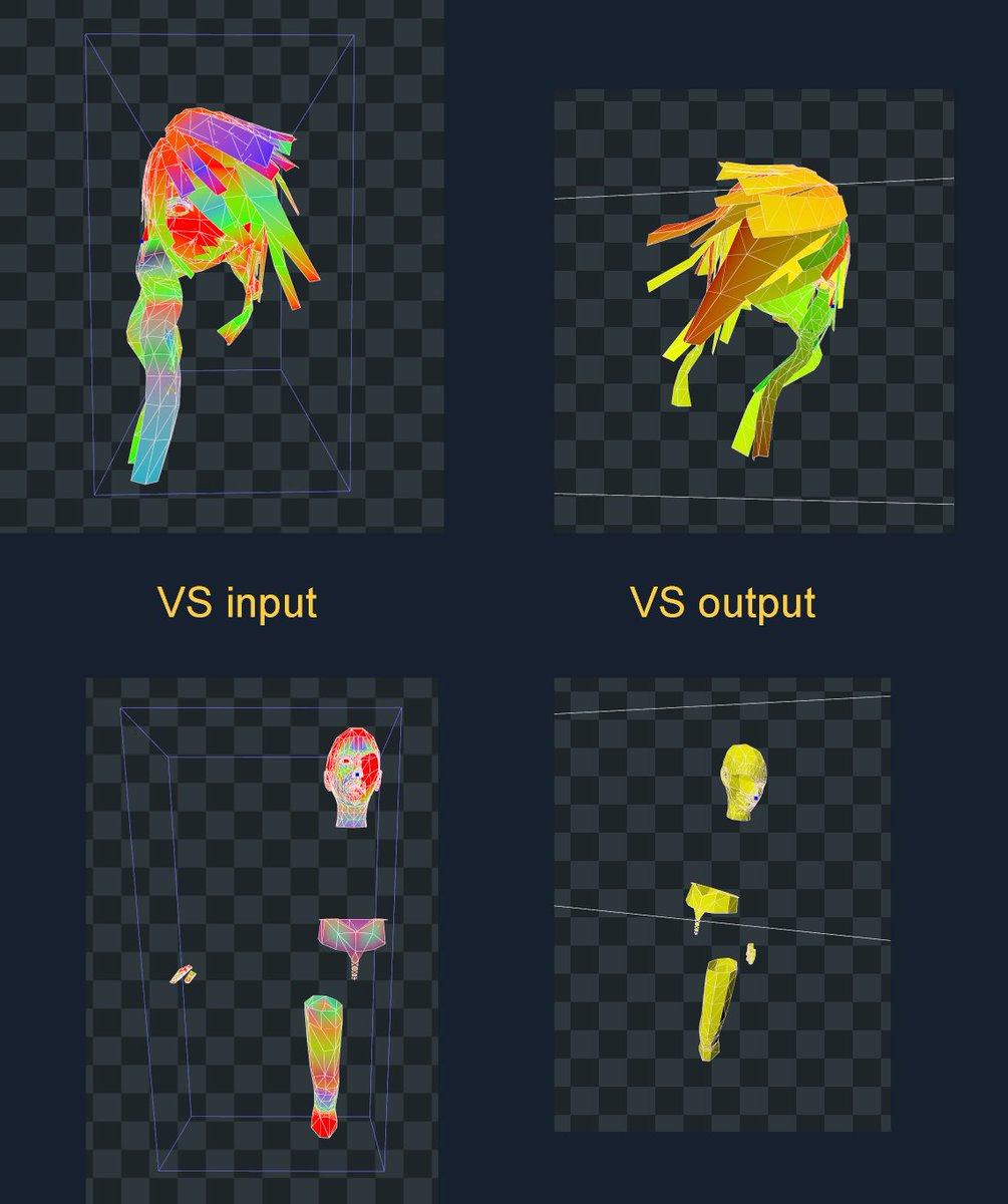
Interesting side effect of GPU skinning is it seems to be running out of precision when it does closeups on this very large animated model
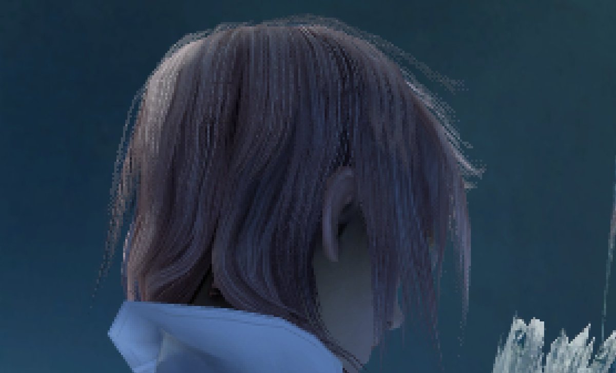
it's visible on the characters too sometimes, although usually much less severe. Probably unnoticeable at 720p on consoles
actually uhh looks like video compression hid most of it. Basically the vertices are wiggling around like a PSX game. You can see it most easily on those spikes on the crown
[SIDE NOTE afaik psx vertex wiggle was actually a rasterizer quirk and not primarily a precision thing]
